J.C Home Decor and Lighting Manufactory


Introduction
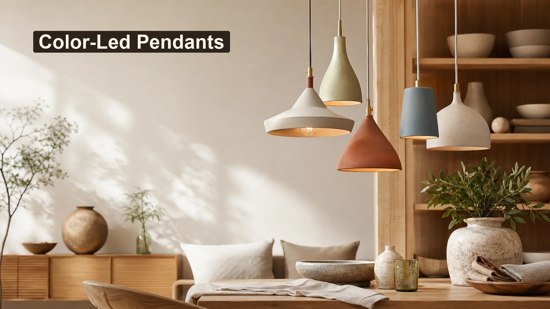
colored pendant lights can become a useful collection idea when the room, product, and display are planned together. The goal is to make a confident design or product-brief decision without inventing dimensions, materials, performance, or market suitability. By the end, you will have a practical way to turn one color idea into a coherent pendant family by separating evergreen core tones, measured accents, and finish behavior.
This guide uses direct comparisons, two fact checks, a topic-specific worksheet, and a final action checklist. It keeps Europe as the first market context and the United States second, while asking buyers to confirm product-specific packaging, labeling, electrical, care, and documentation needs where relevant.
The Topic in Brief
The clearest approach is to turn one color idea into a coherent pendant family by separating evergreen core tones, measured accents, and finish behavior. Begin with the real application instead of selecting a product from one attractive photograph. Then record the design relationship, product details, and confirmation points separately.
For collection teams, this distinction matters. A styling direction can guide shape, color, and assortment, but it cannot confirm material, construction, dimensions, electrical components, planting function, care, or packaging by itself.
The same color file guarantees the same physical appearance. False.
Screen settings, substrate, surface texture, gloss, lighting, and production variation can change perception.
Color needs a defined role in the assortment. True.
Separating core and accent colors helps a collection stay coherent and easier to merchandise.
Choose a Color Role Before Choosing a Shade
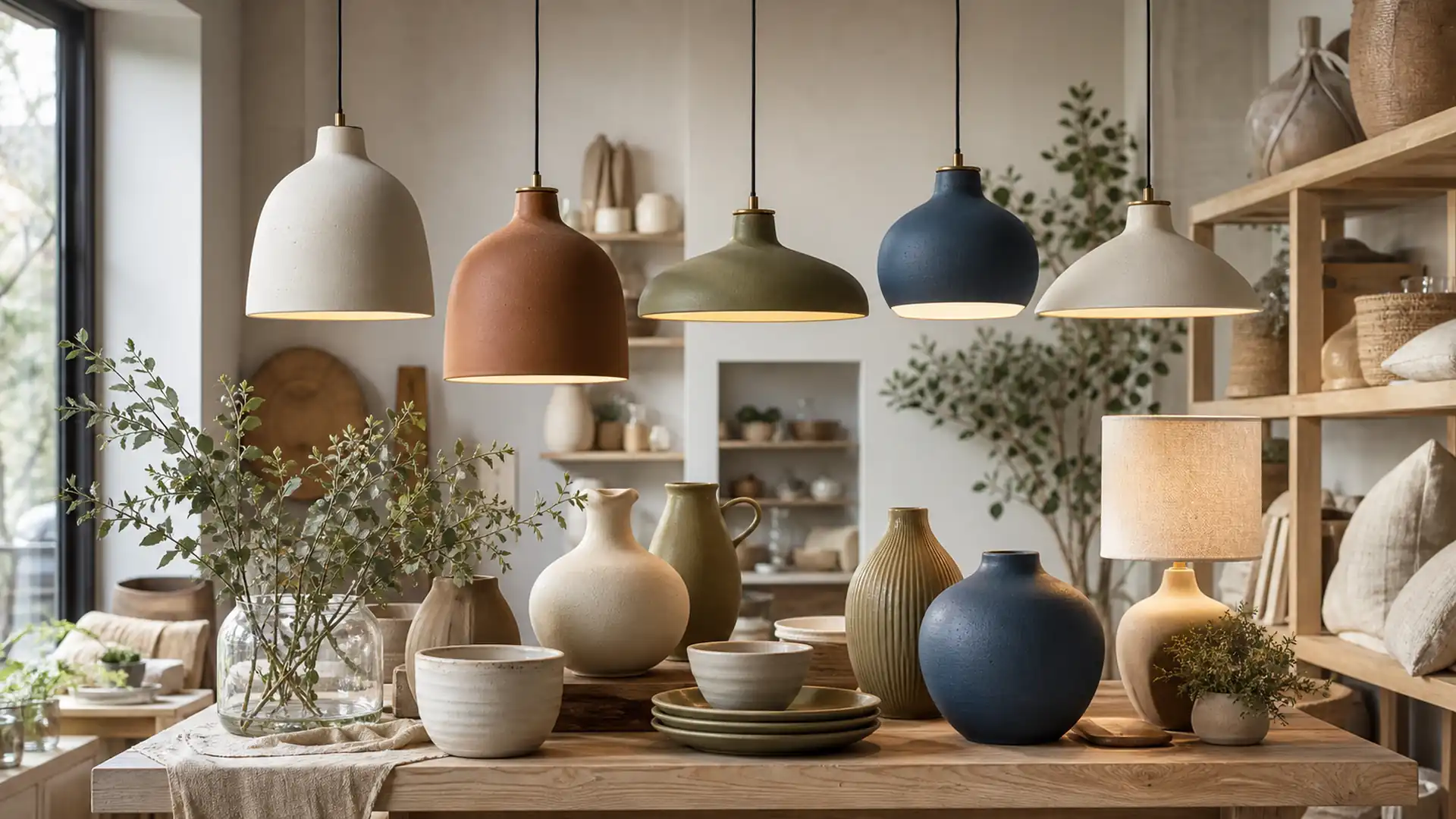
Color can blend, anchor, or accent. A warm neutral pendant may support broad room compatibility, while a muted blue or olive can create a recognizable seasonal or regional story. Decide the role first so the shape and finish reinforce it.
Color should be evaluated on the complete form. Curves, edges, gloss level, and the light source can make the same swatch look different on a finished pendant.
| Application or option | Useful direction | What to confirm |
|---|---|---|
| Evergreen core | Warm white, sand, soft black | Broad collection compatibility |
| Natural accent | Olive, clay, mineral blue | Design-led but restrained |
| Seasonal highlight | One controlled trend color | Limited refresh without replacing the core |
| Two-tone direction | Body and canopy in related contrast | Clear detail without visual noise |
Start with the Ceiling Pendants and the broader Lighting collection to keep the article connected to the correct product taxonomy. Compare the visual direction with Products, P0001 ceiling pendant direction, and P0003 linen pendant direction. For product development, collection, or packaging context, use the P0006 metal pendant direction as a related planning resource. These links provide directions for review; they do not replace confirmed specifications for an individual model.
Connect Color to Shape and Finish
A saturated color often feels stronger on a large simple shade than on a small textured form. Matte surfaces can make color feel quieter, while gloss increases reflection and contrast. These are visual tendencies, not fixed material facts.
Collection teams should review color chips beside the actual surface and under more than one light condition. Screens are useful for direction, but they cannot define the final approved range.
| Palette or context | Product response | Planning note |
|---|---|---|
| Warm retail core | Ivory, clay, muted bronze | Layered and easy to coordinate |
| Fresh European direction | Mineral blue, warm white, oak | Clean restrained contrast |
| Modern graphic direction | Soft black, cream, one rust accent | Strong silhouette |
| Calm natural direction | Olive, sand, linen | Organic collection story |
Every product in a collection needs the same color. False.
A shared undertone, finish family, or repeated accent can connect products without exact matching.
Samples should be reviewed with shape and finish together. True.
A flat color chip cannot show how curves, texture, and reflected light affect the finished product.
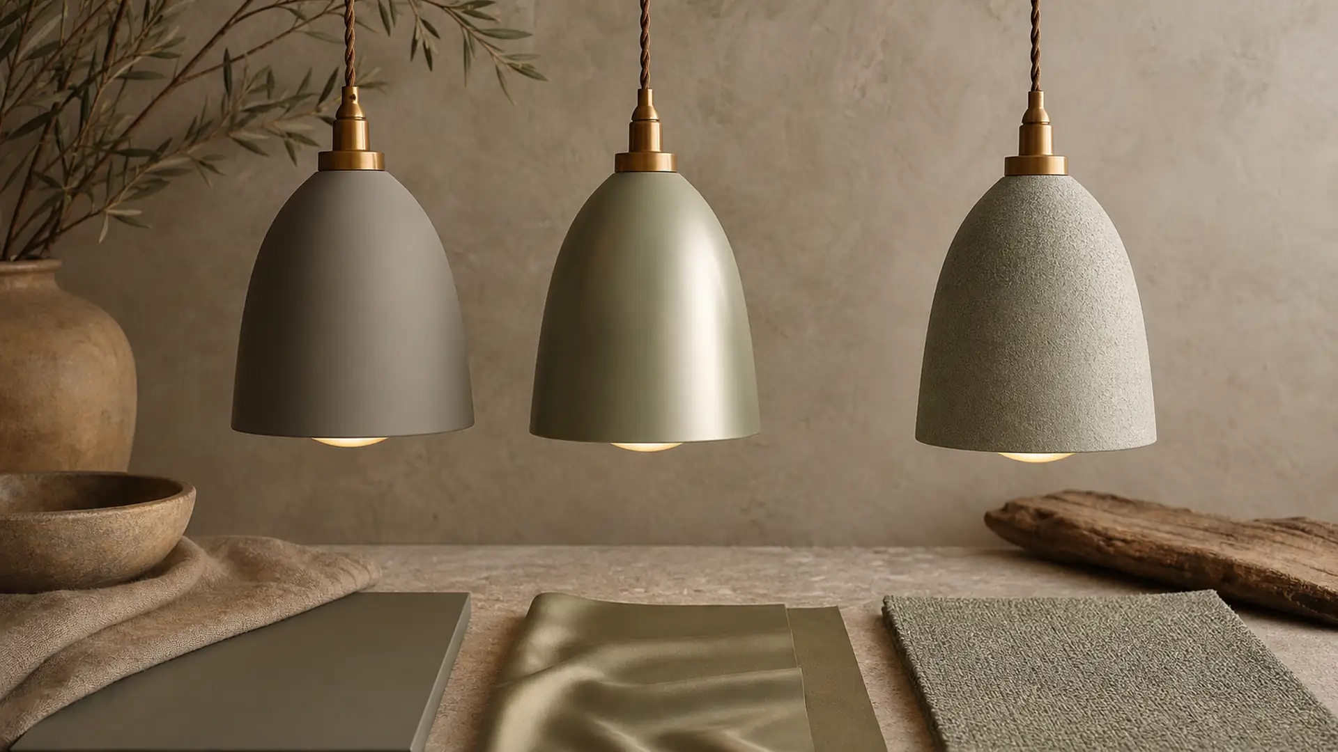
Practical Tool: Core-and-Accent Pendant Color Planner
Use this tool during a room review, retail assortment meeting, or sample discussion. Complete every row with observable information. Leave uncertain specifications blank until product information or samples confirm them.
| Review area | Action | Expected result |
|---|---|---|
| Core colors | Select two long-life neutrals | Stable base assortment |
| Accent color | Choose one story-led tone | Seasonal or display focus |
| Finish behavior | Review matte, gloss, or texture | Predicts visual intensity |
| Repeat cue | Carry color into canopy or related fixture | Collection connection |
The tool is intentionally specific to colored pendant lights. It converts an inspiration image into a short decision record and makes it easier for design, merchandising, purchasing, and product teams to discuss the same direction.
From Visual Direction to a Confirmed Product Brief
A useful pendant brief should record product category, dimensions, material description, color, finish, opening or shade details, visible hardware, care needs, packaging, target market, and any labeling or documentation questions. Custom options can be discussed based on product type and order requirements, but feasibility and final details must be confirmed.
Light quality changes how colors and surfaces are perceived. The U.S. Department of Energy explains that color appearance and color fidelity are separate aspects of light quality that can affect material perception1. Therefore, finish review should include both the unlit and illuminated product.
Electrical and installation decisions require responsible product-specific review. The NFPA consumer checklist advises matching light sources to the safe information provided for the fixture instead of treating every lamp and fixture as interchangeable2. For European markets, applicable electrical equipment may require technical documentation and safety review under the Low Voltage Directive according to the product and voltage scope3. Your Europe also outlines the need to identify applicable requirements and maintain technical documentation before placing covered products on the market4. None of these references certifies a JC product.
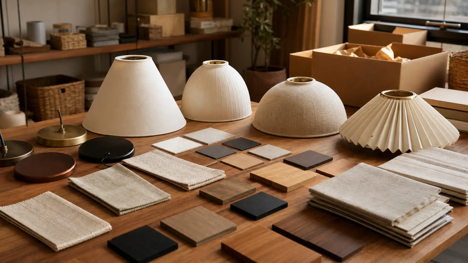
When the direction is ready for discussion, use Request a Quote and send the intended application, target market, product references, dimensions, finish direction, packaging needs, and open questions. Clear inputs make the next conversation more useful without implying a fixed price, quantity, delivery time, or result.
FAQ
Which colored pendant lights are easiest to coordinate?
Warm neutrals and restrained mineral tones often work across several interior directions, but the final palette should follow the target collection.
How many colors should a pendant collection include?
Start with a small core and one or two accents. More colors require stronger merchandising logic and sample control.
Does matte always make color look lighter?
No. Matte changes reflection, but perceived lightness still depends on pigment, substrate, texture, and surrounding light.
Can hardware use a contrasting color?
Yes, when the contrast supports the silhouette and appears consistently across related products.
How should color variation be approved?
Use physical samples, agreed viewing conditions, clear descriptions, and a documented acceptable range where variation is expected.
What information should go into a color brief?
Include target color, finish, substrate, surrounding materials, hardware tone, shade details, packaging needs, and target market.
Conclusion
Colored Pendant Lights for Coordinated Collections is most useful when visual inspiration leads to a clear record of application, proportion, finish, and confirmation points. Use the article as a design and communication guide, then confirm real product information before selection or ordering.
Action checklist
- Define the real room, shelf, furniture, or display context.
- Record the critical dimensions and viewing directions.
- Choose one dominant shape, color, finish, or grouping relationship.
- Complete the Core-and-Accent Pendant Color Planner with the design and product teams.
- Review physical samples for surface, color, proportions, and visible construction.
- Confirm packaging, care, labels, target-market documentation, and other product-specific details.
- Contact JC Home Decor only after the open questions and reference materials are organized.
References
-
U.S. Department of Energy – LED Basics – Supports the note that light color appearance and color fidelity affect how materials and finishes are perceived.
↩ -
National Fire Protection Association – Electrical Safety Checklist – Supports checking lamp compatibility and following responsible electrical-safety guidance.
↩ -
EUR-Lex – Low Voltage Directive 2014/35/EU – Supports product-specific technical documentation and safety review for electrical equipment within the Directive scope.
↩ -
Your Europe – Technical Documentation and EU Conformity – Supports confirming applicable technical documentation before electrical products enter a target market.
↩