J.C Home Decor and Lighting Manufactory

Introduction
This guide turns product photography color into a usable review process for home decor brands, retailers, importers, designers, wholesale partners, and product development teams. It shows how to separate camera, screen, lighting, texture, and batch effects before approving product color, then provides a Photo-to-Sample Color Check for comparing options without turning visual assumptions into product claims. The immediate reader value is a repeatable decision sequence, not a universal style rule.
Define Capture Light in Context
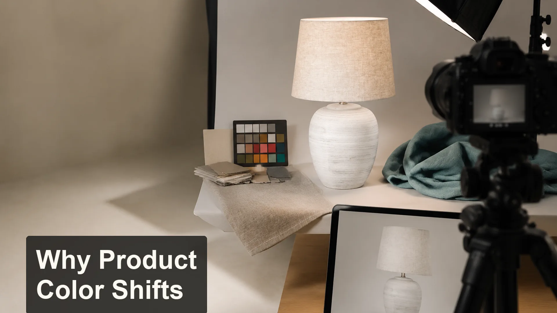
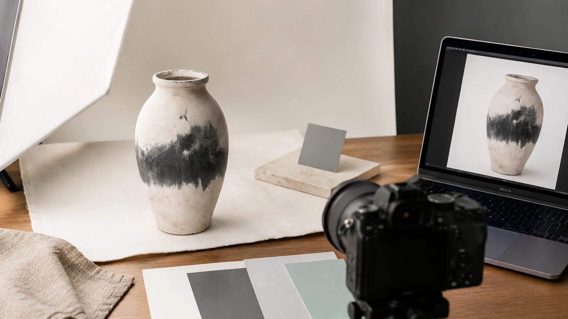
Use the product photography studio as the working context, not as decoration around the product. Compare product photography with a physical sample under a defined light before approving color. A team can then judge whether capture light supports the intended use before it spends time refining surface texture.
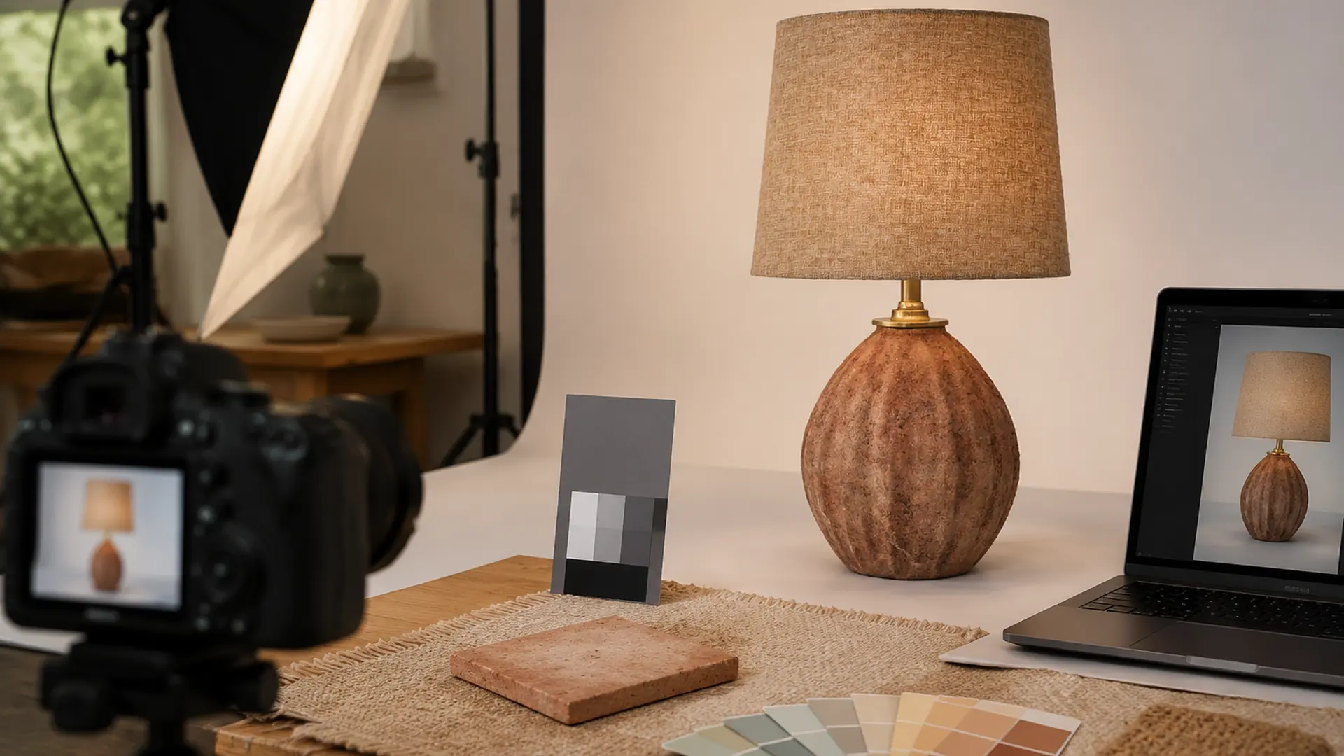
Describe the evidence before interpreting it. For product photography color, record the outline, relative scale, spacing, surface response, light direction, and camera view, monitor glow, and physical sample. Keep exact materials, construction, compliance, and performance open unless supported by verified information for the selected product.
For product photography color, use Lighting collection as the primary category reference and compare it with the broader Decor collection. Related directions such as Table Lamps, Vases, Table Top Accessories, and Decorative Pots connect the review with existing JC categories and practical examples.
| Review variable | Why it matters | Next confirmation |
|---|---|---|
| Capture Light | Compare product photography with a physical sample under a defined light before approving color. | Review it in the intended context |
| Camera Processing | Compare it with capture light | Review it in the intended context |
| Display Screen | Compare it with capture light | Review it in the intended context |
| Surface Texture | Compare it with capture light | Review it in the intended context |
| Physical Sample | Compare it with capture light | Record the unresolved question |
Product Photography Color follows one universal visual rule. False.
The result changes with product scale, room or display context, material behavior, viewing distance, and confirmed specifications. Camera processing, display settings, surroundings, and surface reflection can all shift appearance.
A clear capture light decision improves the review. True.
Compare product photography with a physical sample under a defined light before approving color. The remaining variables can then reinforce the hierarchy instead of competing with it.
Coordinate Capture Light, Camera Processing, and Display Screen
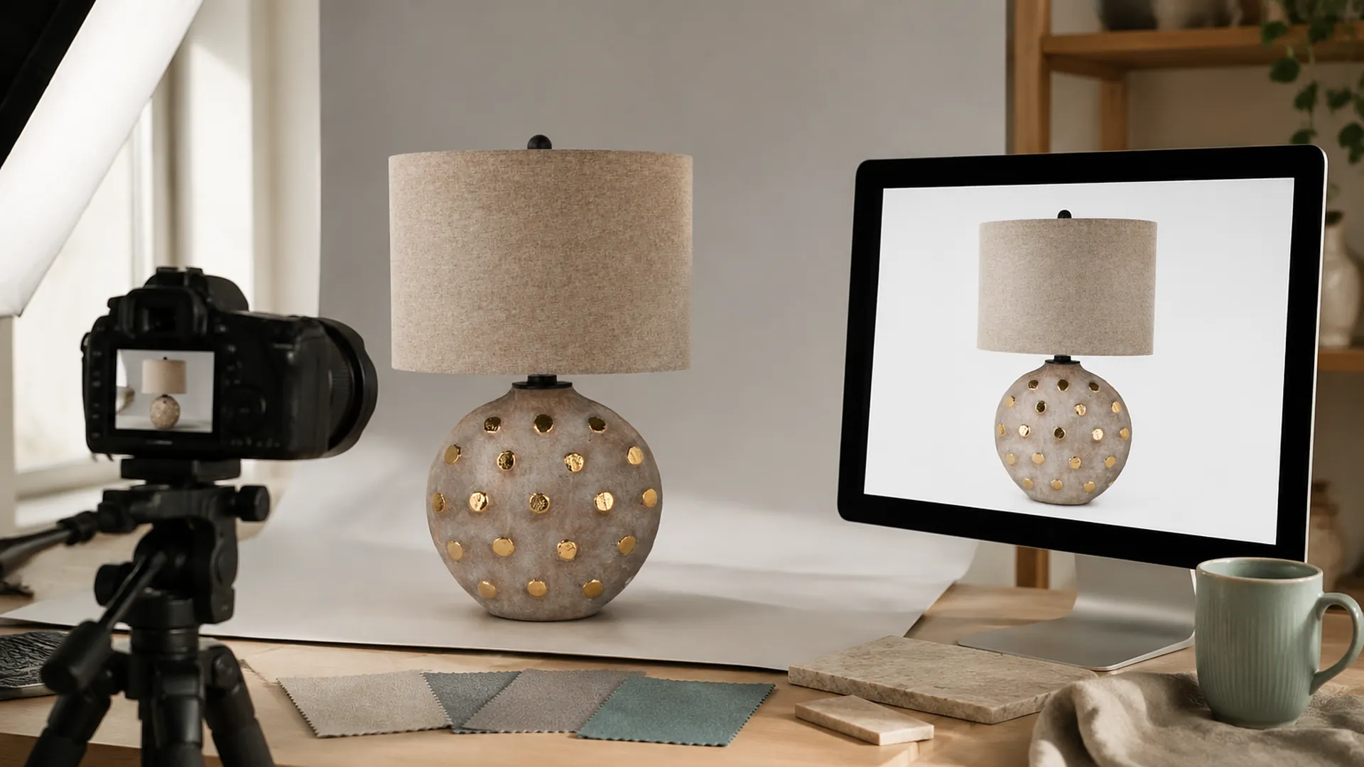
Build the hierarchy around capture light. Let camera processing support that decision, then use display screen and surface texture as checks. If every variable has equal visual strength, the result becomes harder to merchandise, sample, or approve.
The editorial palette for this review is warm white, gray card tones, muted teal, and natural wood. It helps the team see camera view, monitor glow, and physical sample, but it is not a fixed product specification. Check physical samples or verified product information because undertone, reflection, texture, scale, and surrounding light can alter the relationship between camera processing and display screen.
| Context | Recommended priority | Risk control |
|---|---|---|
| Single-category display | Compare product photography with a physical sample under a defined light before approving color. | Avoid adding equal-strength details without hierarchy |
| Cross-category collection | Prioritize camera processing | Avoid camera processing, display settings, surroundings, and surface reflection can all shift appearance. |
| Material and color review | Prioritize display screen | Avoid adding equal-strength details without hierarchy |
| Packaging or sample communication | Prioritize surface texture | Separate confirmed facts from open questions |
Change one of the five review variables at a time. Keep the camera position or viewing point stable, record why the alternative was stronger or weaker, and retain the rejected option long enough to explain the decision. For product photography color, this is more useful than a folder of unrelated references.
A screen image settles camera processing, display screen, and surface texture. False.
For product photography color, camera processing, display settings, viewing light, texture, and scale can change what the team sees. Images communicate direction, but decisions about camera processing or display screen need verified details and, where relevant, samples.
A written Photo-to-Sample Color Check makes the comparison repeatable. True.
Recording capture light, camera processing, display screen, surface texture, physical sample under the same review conditions makes later sample, display, and product discussions easier to compare.
Practical Tool: Photo-to-Sample Color Check
Use the Photo-to-Sample Color Check where inspiration must become a decision record. Complete each row with an observation, a source of evidence, and an unresolved question. A blank field is safer than an invented specification.
| Field | What to record | Decision test |
|---|---|---|
| Capture Light | Compare product photography with a physical sample under a defined light before approving color. | Does it support capture light? |
| Camera Processing | Describe the current camera processing direction | Does it support capture light? |
| Display Screen | Describe the current display screen direction | Does it support capture light? |
| Surface Texture | Describe the current surface texture direction | Does it support capture light? |
| Physical Sample | Describe the current physical sample direction | Is the evidence sufficient for approval? |
Read the completed tool once from the end user’s or retail viewer’s position and once from the product-review position. The first pass checks whether capture light remains clear at normal distance. The second looks more closely at camera view, monitor glow, and physical sample, visible joints or edges, base contact, shade or opening details, and relevant packaging contact points.
Add an owner beside every open physical sample question. One person may confirm product information, another may review the sample, and another may approve packaging, electrical, label, or target-market details. The Photo-to-Sample Color Check should show that responsibility without inventing a fixed sample or delivery schedule.
Translate the Photo-to-Sample Color Check into a Product Brief
A usable product photography color brief has three layers: the visual intention, facts confirmed for the selected item, and questions awaiting evidence. State the application, viewing direction, available or confirmed dimensions, material and finish language, and the chosen relationship between capture light, camera processing, and display screen. Add reference images only when their purpose is clear.
For a lighting-and-decor collection, make one row per item rather than applying one assumption to every category. Record capture light, camera processing, display screen, and surface texture for each lamp, vase, pot, or decorative object. Lighting rows need separate electrical and target-market questions; fragile or finished decor rows need separate base-contact, surface-separation, and inner-protection questions. Use physical sample to show what remains unresolved.
Color and finish appearance depends on viewing and measurement conditions when a team evaluates product photography color, especially where capture light and camera processing interact. This principle is supported by NIST – Color and Appearance1. For the next review layer, Canadian Conservation Institute – Care of Ceramics and Glass2 helps keep display screen and product-specific questions separate from visual preference. International Color Consortium – Color Management FAQs3 provides context for documenting surface texture without turning a general reference into an unverified product claim.
Use Request a Quote to send the completed Photo-to-Sample Color Check, selected references, intended product photography studio context, target market, and open physical sample questions. Contact Us is another route for an initial discussion. Customization, sample timing, delivery, packaging, electrical, and documentation details must be confirmed for the specific product and request.
FAQ
What should I review first for product photography color?
Start in the intended product photography studio, or in the nearest real display or sample-review context. Record capture light, camera processing, and display screen before debating surface texture; that order keeps the review tied to separate camera, screen, lighting, texture, and batch effects before approving product color.
What can a product photo confirm about capture light?
A photograph can show the direction of capture light, but it cannot independently confirm final color, finish, scale, construction, or performance. For product photography color, compare the image with dimensions, verified product information, and a physical sample whenever camera processing or display screen affects approval.
How can retailers apply the Photo-to-Sample Color Check?
Use the Photo-to-Sample Color Check to give every option the same review fields. A retailer can record the intended display zone, capture light, camera processing, supporting color or finish cues, usable space, and the unresolved physical sample question before narrowing an assortment.
What should a designer add to a product photography color brief?
Add the intended placement, viewing direction, available dimensions, confirmed material information, finish direction, and references that explain camera view, monitor glow, and physical sample. Mark assumptions about surface texture, construction, packaging, or target-market documents as open questions rather than specifications.
Must related colors or finishes look identical?
No. Coordination depends on the material response and the intended hierarchy. Compare product photography with a physical sample under a defined light before approving color. Judge the relationship between capture light and camera processing under a defined light instead of relying on identical screen colors.
When should I request a sample for product photography color?
Request or review a sample when camera processing, display screen, surface texture, or visible variation could change the decision. Use warm white, gray card tones, muted teal, and natural wood only as the planning direction, and record the viewing light and comparison reference used for approval.
What product and target-market details remain to be confirmed?
For a cross-category request, identify which items are lighting and which are decorative objects. Confirm capture light, camera processing, and display screen by item, with separate packaging, electrical, label, and documentation questions where they apply.
How should I send this direction to JC Home Decor?
Send the completed Photo-to-Sample Color Check, relevant product references, intended application, target market, dimensions, and unresolved points covering capture light, camera processing, display screen, surface texture, physical sample. Customization, samples, packaging, timing, and documentation remain product- and request-specific.
Conclusion
Why Product Photography Color Can Differ from the Real Product becomes actionable when the team can explain how capture light relates to camera processing, what evidence supports display screen, and which physical sample questions remain open. The Photo-to-Sample Color Check provides that record for a sample, assortment, display, or product-development conversation.
Action checklist
- Define the product photography studio or nearest real review context and viewing direction.
- Record available dimensions and the current capture light evidence.
- Compare camera processing and display screen without changing every variable at once.
- Use surface texture to check whether the main direction remains coherent.
- Complete the Photo-to-Sample Color Check, including unresolved physical sample questions.
- Review relevant samples under a stated light and from the intended distance.
- Separate confirmed materials, construction, packaging, electrical, label, and target-market facts from assumptions.
- Send the organized product photography color brief to JC Home Decor for product-specific discussion.
References
- NIST – Color and Appearance – Supports measurement context for color and appearance.↩
- Canadian Conservation Institute – Care of Ceramics and Glass – Supports careful handling and surface protection.↩
- International Color Consortium – Color Management FAQs – Supports device-dependent color and color-management context.↩