J.C Home Decor and Lighting Manufactory

Introduction
rattan-look pendant lighting can become a useful collection idea when the room, product, and display are planned together. The goal is to make a confident design or product-brief decision without inventing dimensions, materials, performance, or market suitability. By the end, you will have a practical way to balance open woven texture with simple furniture, honest material wording, and controlled natural colors in relaxed residential or retail settings.
This guide uses direct comparisons, two fact checks, a topic-specific worksheet, and a final action checklist. It keeps Europe as the first market context and the United States second, while asking buyers to confirm product-specific packaging, labeling, electrical, care, and documentation needs where relevant.
The Topic in Brief
The clearest approach is to balance open woven texture with simple furniture, honest material wording, and controlled natural colors in relaxed residential or retail settings. Begin with the real application instead of selecting a product from one attractive photograph. Then record the design relationship, product details, and confirmation points separately.
For collection teams, this distinction matters. A styling direction can guide shape, color, and assortment, but it cannot confirm material, construction, dimensions, electrical components, planting function, care, or packaging by itself.
A woven appearance proves the shade is natural rattan. False.
Visual effect and physical material are different facts and must be confirmed separately.
Smooth supporting surfaces make woven texture easier to read. True.
Material contrast gives the pendant a clear role and keeps an organic interior from becoming visually busy.
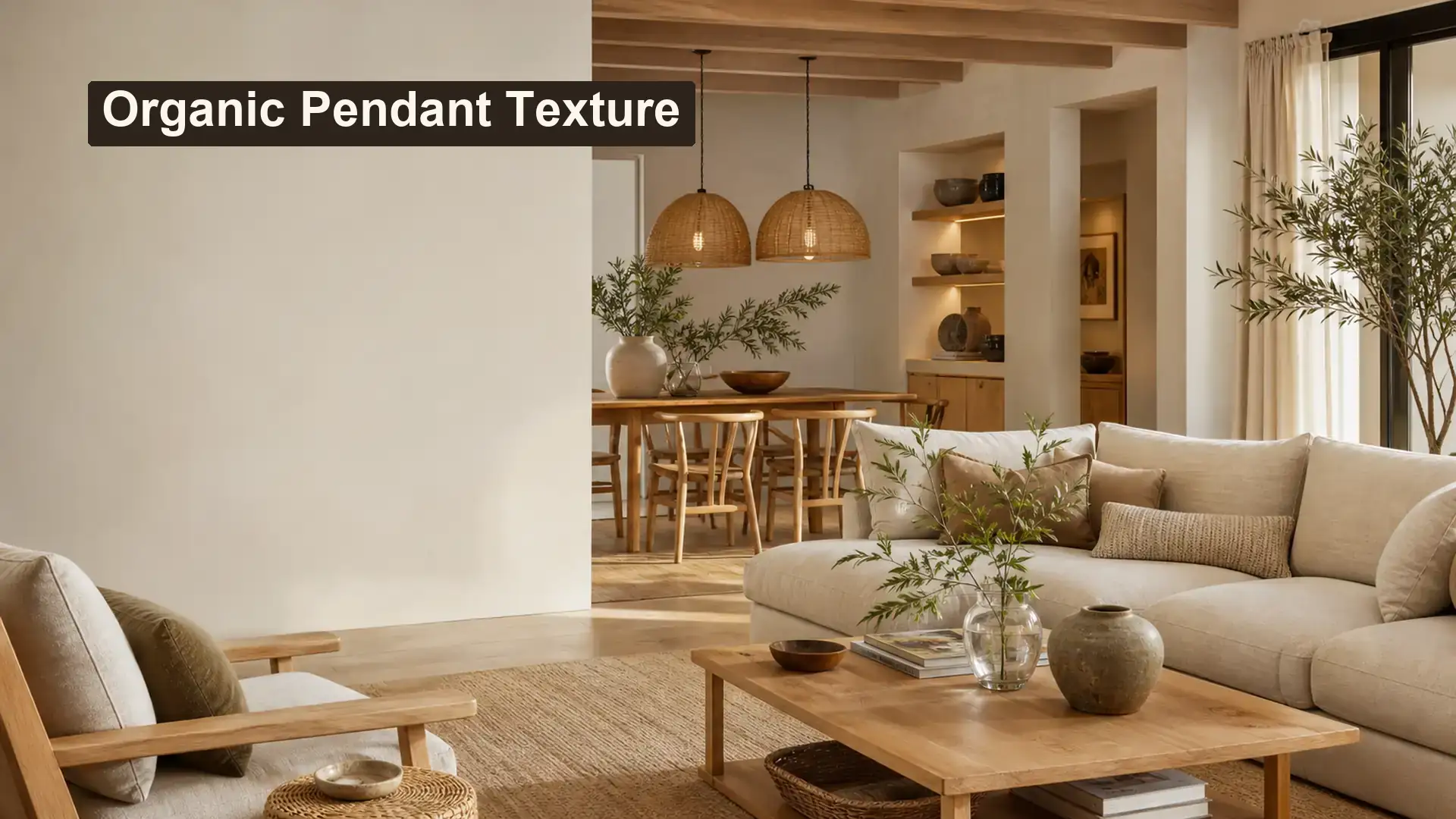
Use Woven Texture as a Visual Filter
An open woven-looking shade can soften the outline of a light source and add patterned shadow. The room should still have calm surfaces so the texture remains intentional. Heavy texture on the pendant, rug, wall, and furniture at the same time can make a relaxed concept feel crowded.
Material wording must stay accurate. A rattan-look, fiber-look, or woven-look effect should not be described as natural rattan unless product information confirms the material.
| Application or option | Useful direction | What to confirm |
|---|---|---|
| Open cone | Light visual weight and broad outline | Weave spacing, edge finish, visible frame |
| Rounded basket | Soft focal shape | Top and bottom transition |
| Tight cylinder | More architectural rhythm | Consistency and internal structure |
| Layered fringe form | Expressive organic accent | Loose fibers, handling, packaging |
Start with the Ceiling Pendants and the broader Lighting collection to keep the article connected to the correct product taxonomy. Compare the visual direction with Products, P0004 woven pendant direction, and P0003 linen pendant direction. For product development, collection, or packaging context, use the custom lighting and packaging guide as a related planning resource. These links provide directions for review; they do not replace confirmed specifications for an individual model.
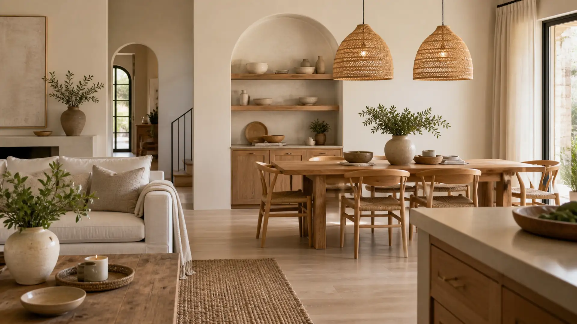
Pair Texture with Quiet Supporting Materials
Light oak, washed wood tones, linen, warm plaster, and matte ceramic accents create a useful background. Choose one darker line in the canopy, cord, or furniture to stop the palette from becoming flat.
In retail displays, place woven-looking pendants near smooth objects rather than more open baskets. Material contrast makes the product easier to understand and supports a clearer collection story.
| Palette or context | Product response | Planning note |
|---|---|---|
| Sand and warm white | Woven-look shade with pale frame | Soft residential direction |
| Olive and clay | Natural-tone texture with dark detail | Earthy but controlled |
| Blue-white ceramic accents | Quiet neutral woven form | Fresh contrast without theme styling |
| Dark wood and linen | Lighter open shade | Balances heavier furniture |
Open shades remove the need to review the light source. False.
An open form can expose the lamp and produce visible shadows, so the complete lighting effect still needs review.
Edge, frame, and suspension details affect perceived quality. True.
Small construction details shape the silhouette and should be included in sample and packaging review.
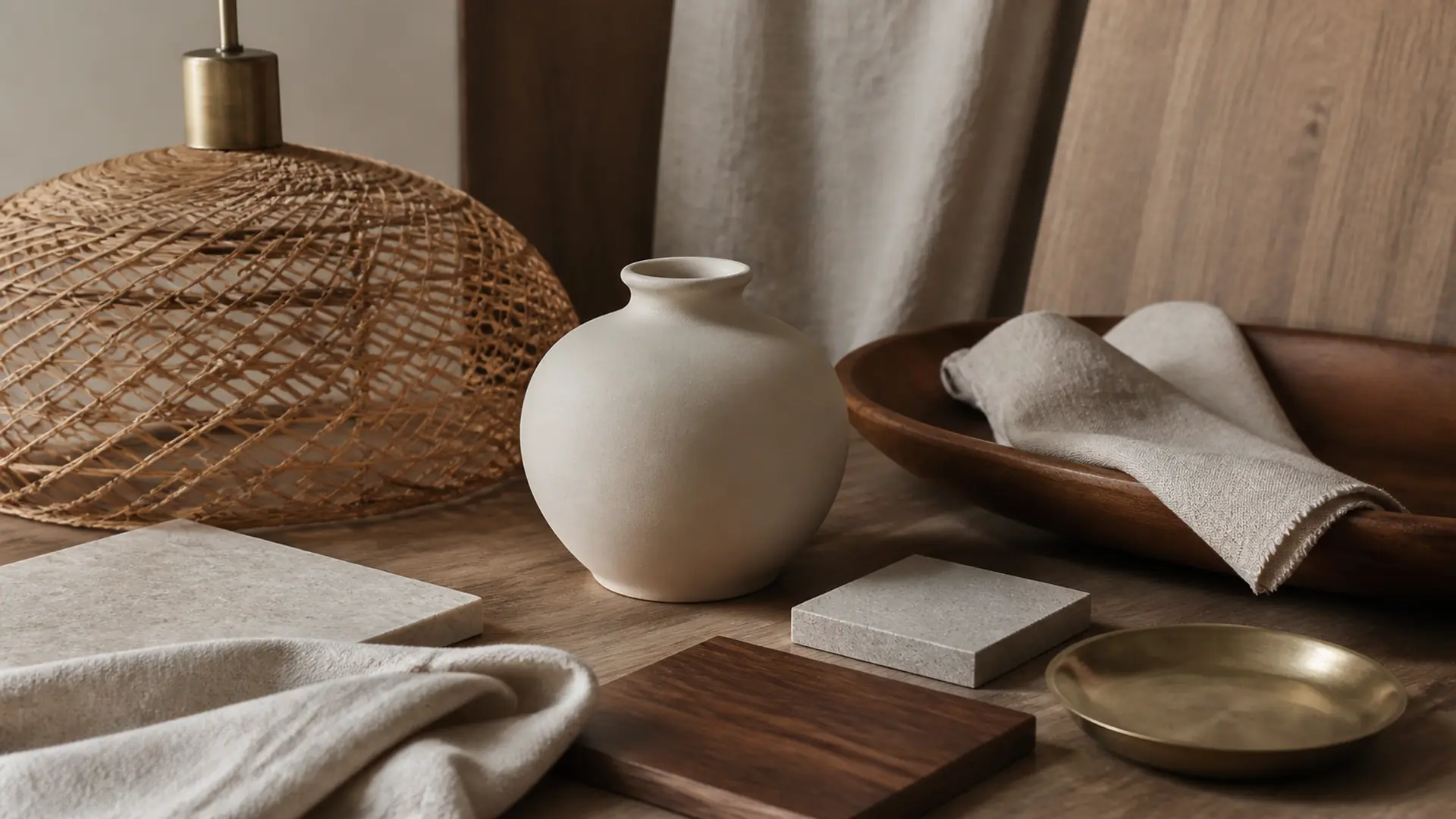
Practical Tool: Organic Texture Balance Board
Use this tool during a room review, retail assortment meeting, or sample discussion. Complete every row with observable information. Leave uncertain specifications blank until product information or samples confirm them.
| Review area | Action | Expected result |
|---|---|---|
| Primary texture | Choose the pendant weave as the lead | Clear focal material |
| Smooth counterpoint | Add ceramic, glass, or plaster | Prevents visual overload |
| Dark line | Repeat canopy or frame tone once | Gives definition |
| Material wording | Record confirmed material separately from visual effect | Accurate product copy |
The tool is intentionally specific to rattan-look pendant lighting. It converts an inspiration image into a short decision record and makes it easier for design, merchandising, purchasing, and product teams to discuss the same direction.
From Visual Direction to a Confirmed Product Brief
A useful pendant brief should record product category, dimensions, material description, color, finish, opening or shade details, visible hardware, care needs, packaging, target market, and any labeling or documentation questions. Custom options can be discussed based on product type and order requirements, but feasibility and final details must be confirmed.
Light quality changes how colors and surfaces are perceived. The U.S. Department of Energy explains that color appearance and color fidelity are separate aspects of light quality that can affect material perception1. Therefore, finish review should include both the unlit and illuminated product.
Electrical and installation decisions require responsible product-specific review. The NFPA consumer checklist advises matching light sources to the safe information provided for the fixture instead of treating every lamp and fixture as interchangeable2. For European markets, applicable electrical equipment may require technical documentation and safety review under the Low Voltage Directive according to the product and voltage scope3. Your Europe also outlines the need to identify applicable requirements and maintain technical documentation before placing covered products on the market4. None of these references certifies a JC product.
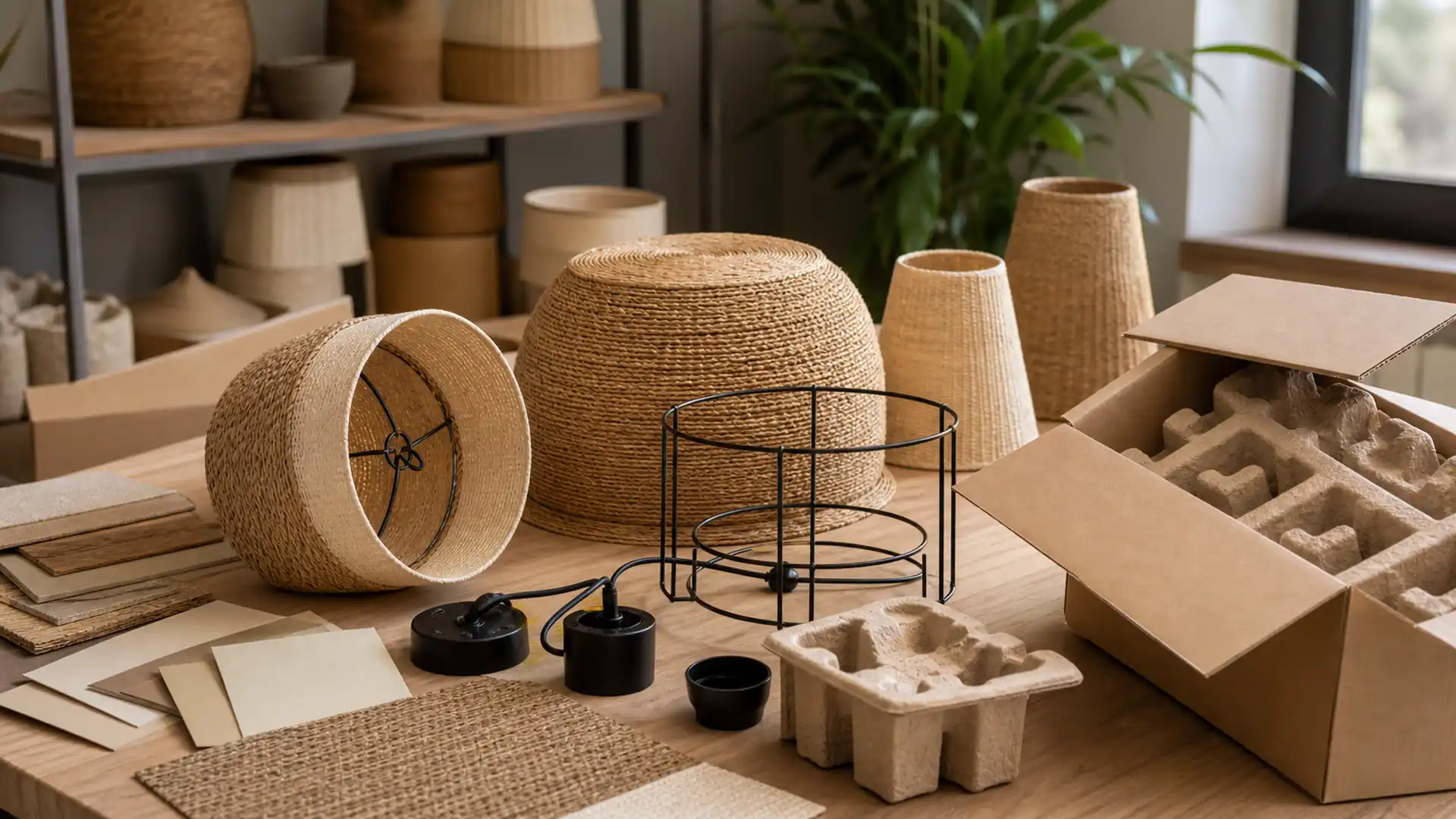
When the direction is ready for discussion, use Request a Quote and send the intended application, target market, product references, dimensions, finish direction, packaging needs, and open questions. Clear inputs make the next conversation more useful without implying a fixed price, quantity, delivery time, or result.
FAQ
What does rattan-look pendant lighting mean?
It describes a woven visual direction without claiming a specific natural material. Confirm the exact material from product information.
Which rooms suit woven-looking pendants?
Dining areas, relaxed living spaces, bedrooms, and curated retail displays can suit them when scale and light behavior are appropriate.
Can woven pendants work in modern interiors?
Yes. Pair one tactile form with simple architecture, smooth surfaces, and a limited palette.
What should be checked in a sample?
Check weave or surface consistency, frame visibility, edges, suspension, shade shape, light behavior, and material description.
How should woven forms be packaged?
Review support around the shade, protection from crushing, surface abrasion, loose elements, and separation from hardware.
Are these pendants automatically suitable outdoors?
No. Outdoor suitability requires product-specific confirmation and should never be inferred from the appearance.
Conclusion
Rattan-Look Pendant Lighting for Organic-Style Spaces is most useful when visual inspiration leads to a clear record of application, proportion, finish, and confirmation points. Use the article as a design and communication guide, then confirm real product information before selection or ordering.
Action checklist
- Define the real room, shelf, furniture, or display context.
- Record the critical dimensions and viewing directions.
- Choose one dominant shape, color, finish, or grouping relationship.
- Complete the Organic Texture Balance Board with the design and product teams.
- Review physical samples for surface, color, proportions, and visible construction.
- Confirm packaging, care, labels, target-market documentation, and other product-specific details.
- Contact JC Home Decor only after the open questions and reference materials are organized.
References
-
U.S. Department of Energy – LED Basics – Supports the note that light color appearance and color fidelity affect how materials and finishes are perceived.
↩ -
National Fire Protection Association – Electrical Safety Checklist – Supports checking lamp compatibility and following responsible electrical-safety guidance.
↩ -
EUR-Lex – Low Voltage Directive 2014/35/EU – Supports product-specific technical documentation and safety review for electrical equipment within the Directive scope.
↩ -
Your Europe – Technical Documentation and EU Conformity – Supports confirming applicable technical documentation before electrical products enter a target market.
↩