J.C Home Decor and Lighting Manufactory


Introduction
seasonal ceramic pot colors can become a useful collection idea when the room, product, and display are planned together. The goal is to make a confident design or product-brief decision without inventing dimensions, materials, performance, or market suitability. By the end, you will have a practical way to build a stable neutral core and rotate controlled accent tones so a ceramic pot collection can support seasonal displays without losing identity.
This guide uses direct comparisons, two fact checks, a topic-specific worksheet, and a final action checklist. It keeps Europe as the first market context and the United States second, while asking buyers to confirm product-specific packaging, labeling, electrical, care, and documentation needs where relevant.
The Topic in Brief
The clearest approach is to build a stable neutral core and rotate controlled accent tones so a ceramic pot collection can support seasonal displays without losing identity. Begin with the real application instead of selecting a product from one attractive photograph. Then record the design relationship, product details, and confirmation points separately.
For collection teams, this distinction matters. A styling direction can guide shape, color, and assortment, but it cannot confirm material, construction, dimensions, electrical components, planting function, care, or packaging by itself.
Seasonal color planning requires four separate collections. False.
A stable core with limited accents can create seasonal flexibility with less fragmentation.
Color and finish should be approved together. True.
Gloss, texture, curvature, and light change how a color appears on the final object.
Keep the Core Stable and the Accent Flexible
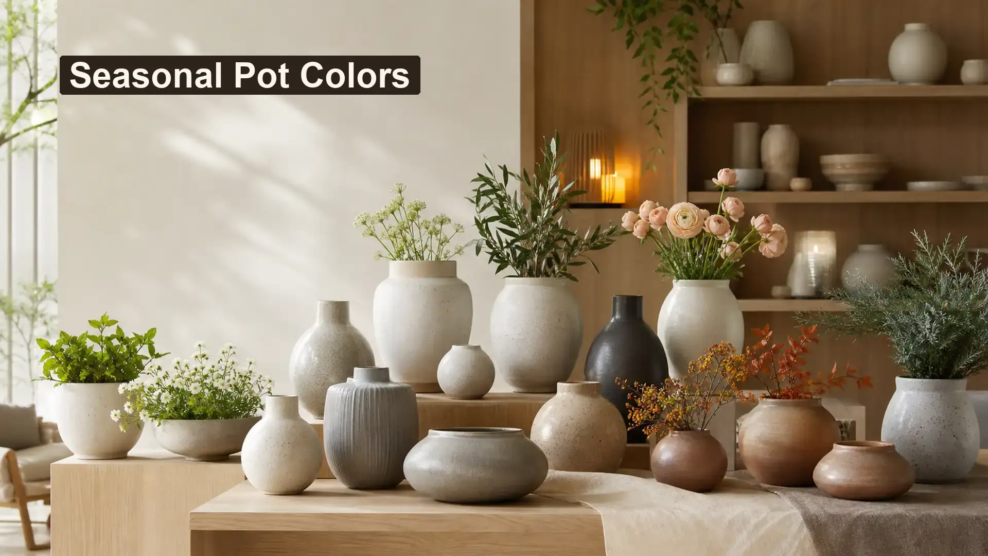
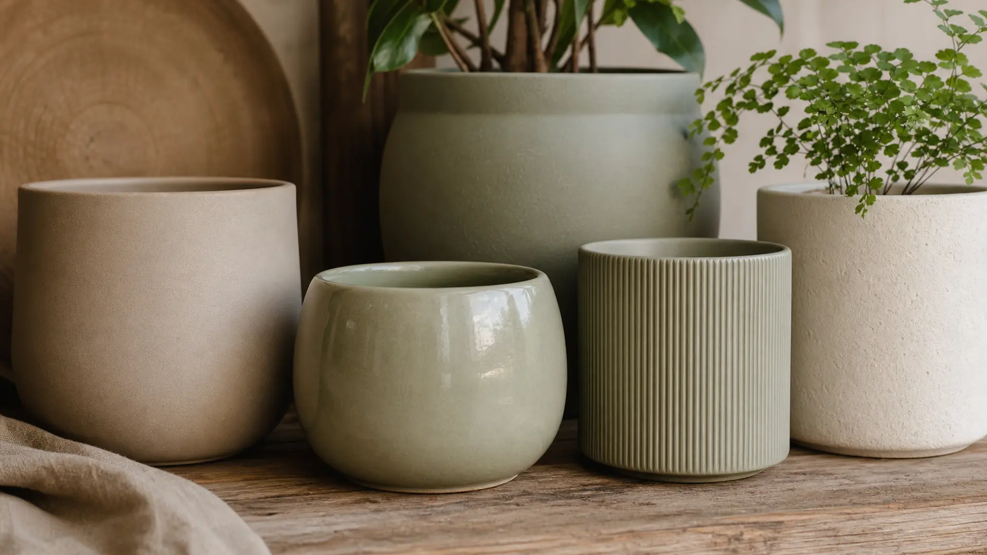
A seasonal collection does not need a complete color reset. Warm white, sand, greige, or another long-life neutral can form the core. Then add one or two accent tones that work with the season and the retailer’s broader story.
The accent should have a defined role. It can lead a window display, identify one form, or repeat across a small group. Too many seasonal colors make restocking and collection recognition harder.
| Application or option | Useful direction | What to confirm |
|---|---|---|
| Core neutral | Long-life base across seasons | Stable product identity |
| Spring accent | Soft green, mineral blue, or pale clay | Fresh controlled update |
| Autumn accent | Rust, ochre, or deeper olive | Warm visual layer |
| Holiday or event accent | One limited high-contrast tone | Short focused story |
Start with the Decorative Pots and the broader Decor collection to keep the article connected to the correct product taxonomy. Compare the visual direction with Products, V0536 decorative pot direction, and DSC0019 decorative pot direction. For product development, collection, or packaging context, use the DSC0018 decorative pot direction as a related planning resource. These links provide directions for review; they do not replace confirmed specifications for an individual model.
Review Color on the Finished Surface
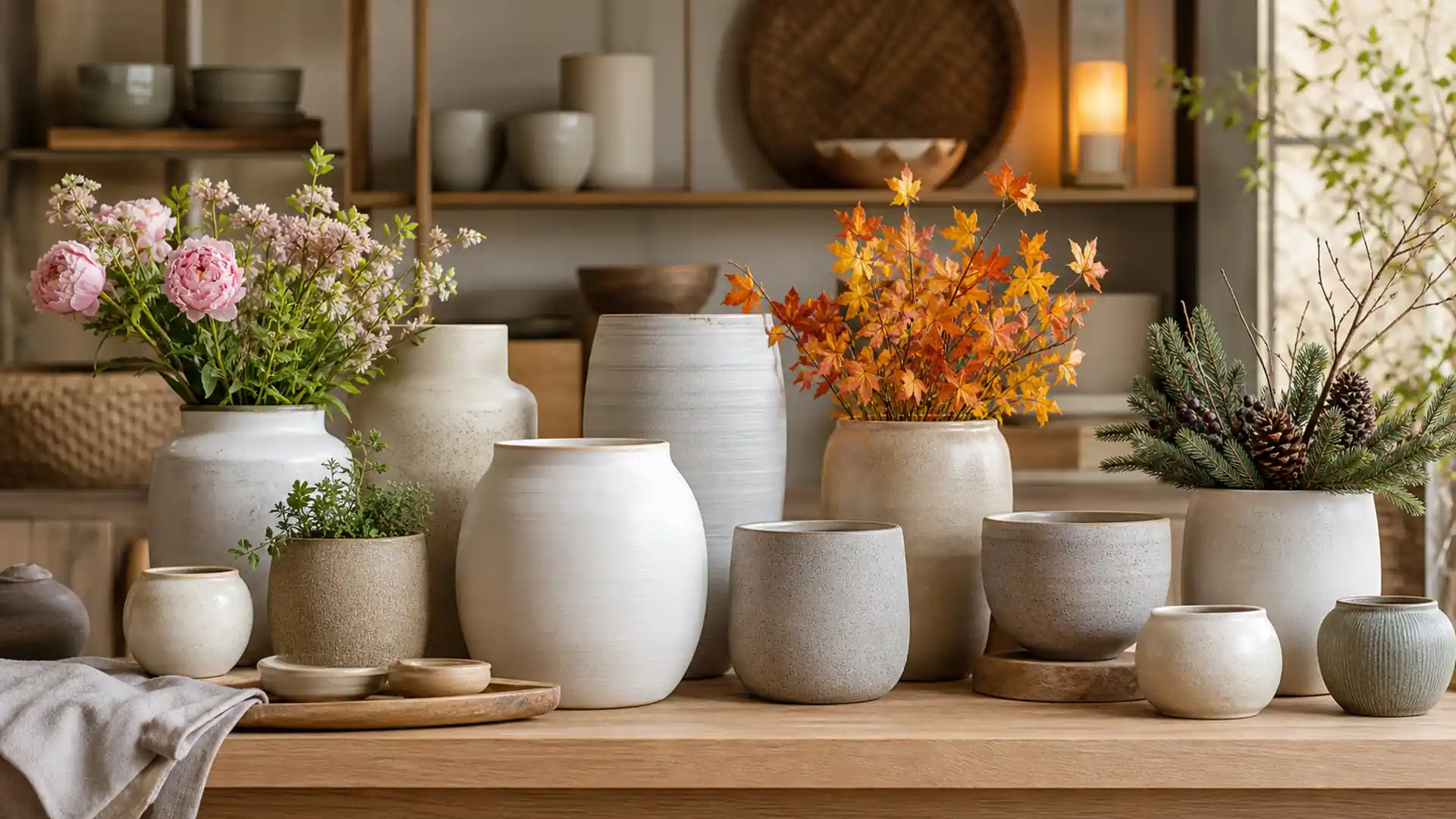
A color behaves differently on matte, glossy, textured, or reactive-looking surfaces. Approve the color and finish together. Physical samples also reveal how curved areas, rims, and recessed textures catch light.
For a coordinated assortment, keep at least one form available in the core color while the accent changes. This makes the seasonal update easier to connect with existing products.
| Palette or context | Product response | Planning note |
|---|---|---|
| Spring calm | Warm white, sage, mineral blue | Fresh restrained display |
| Summer natural | Sand, pale clay, olive | Organic retail story |
| Autumn warmth | Cream, rust, muted ochre | Layered warmth |
| Winter graphic | Ivory, soft black, one deep green | Clear contrast |
A digital color reference is the final approval standard. False.
Screens differ, and the finished ceramic surface can shift perceived color and depth.
A carryover form helps customers understand seasonal change. True.
Showing one silhouette in both core and accent colors makes the collection relationship visible.
Practical Tool: Core-and-Accent Color Calendar
Use this tool during a room review, retail assortment meeting, or sample discussion. Complete every row with observable information. Leave uncertain specifications blank until product information or samples confirm them.
| Review area | Action | Expected result |
|---|---|---|
| Core color | Keep across all four seasons | Collection continuity |
| Seasonal accent | Assign one lead tone per story | Focused refresh |
| Carryover form | Repeat one shape in core and accent | Easy comparison |
| Sample checkpoint | Review color plus finish under real light | Controlled approval |
The tool is intentionally specific to seasonal ceramic pot colors. It converts an inspiration image into a short decision record and makes it easier for design, merchandising, purchasing, and product teams to discuss the same direction.
From Visual Direction to a Confirmed Product Brief
A useful pot brief should record product category, dimensions, material description, color, finish, opening or shade details, visible hardware, care needs, packaging, target market, and any labeling or documentation questions. Custom options can be discussed based on product type and order requirements, but feasibility and final details must be confirmed.
Product copy must separate decorative use from direct planting. The Royal Horticultural Society states that containers used for growing plants need suitable drainage to help avoid waterlogging1. Penn State Extension also describes the relationship between a draining plant pot and a decorative outer container when houseplants are repotted2. These sources do not prove that a specific decorative pot is a planter.
Handling and care need equal attention. The Canadian Conservation Institute notes that ceramic objects are hard but brittle and can break, chip, or scratch under physical force during handling and display3. Its care guidance also recommends conservative handling and cleaning for decorated or uncertain ceramic surfaces rather than one universal cleaning method4. Product-specific care instructions should still be confirmed.
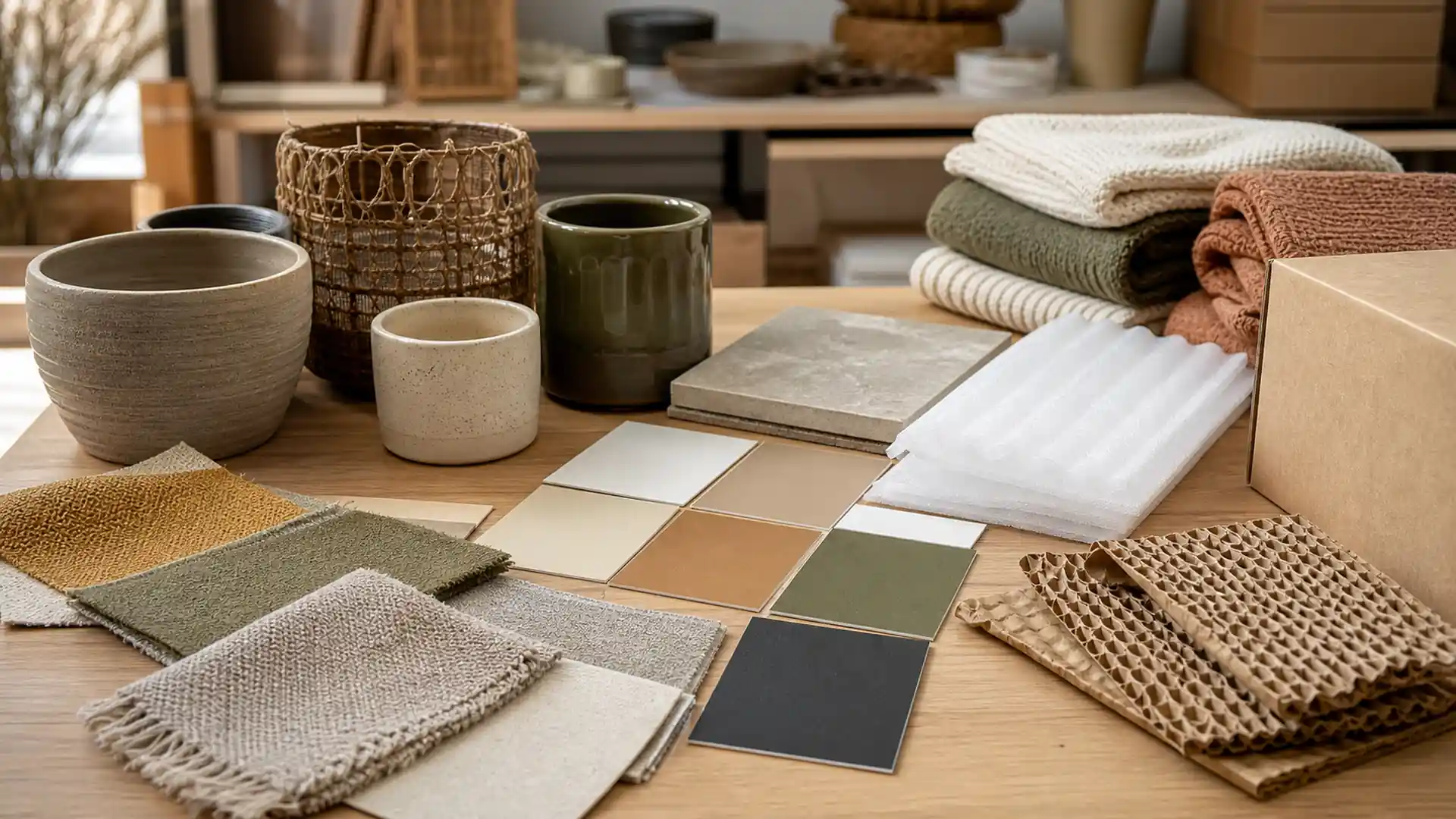
When the direction is ready for discussion, use Request a Quote and send the intended application, target market, product references, dimensions, finish direction, packaging needs, and open questions. Clear inputs make the next conversation more useful without implying a fixed price, quantity, delivery time, or result.
FAQ
How many seasonal ceramic pot colors should a collection use?
Start with a stable core and one or two accents for each story. The right number depends on the assortment and display plan.
Which neutral works across seasons?
Warm white, sand, greige, and selected pale clay tones are useful directions, but confirm the target undertone.
Should seasonal colors use the same finish?
Not always, but finish changes should be intentional and sampled because they change perceived color.
How can retailers reduce leftover seasonal stock?
Use accents on selected forms while keeping core colors and carryover shapes available across stories.
How should glaze color variation be communicated?
Define an acceptable visual range through approved samples and conservative product copy.
What should a seasonal color brief include?
Include color role, finish, form, target market, display timing, packaging, photography, and labeling needs.
Conclusion
Seasonal Ceramic Pot Colors for Flexible Collections is most useful when visual inspiration leads to a clear record of application, proportion, finish, and confirmation points. Use the article as a design and communication guide, then confirm real product information before selection or ordering.
Action checklist
- Define the real room, shelf, furniture, or display context.
- Record the critical dimensions and viewing directions.
- Choose one dominant shape, color, finish, or grouping relationship.
- Complete the Core-and-Accent Color Calendar with the design and product teams.
- Review physical samples for surface, color, proportions, and visible construction.
- Confirm packaging, care, labels, target-market documentation, and other product-specific details.
- Contact JC Home Decor only after the open questions and reference materials are organized.
References
-
Royal Horticultural Society – Growing Plants in Containers – Supports the distinction between decorative containers and planting containers that need suitable drainage.
↩ -
Penn State Extension – Repotting Houseplants – Supports checking the relationship between a draining inner pot and a decorative outer container.
↩ -
Canadian Conservation Institute – Caring for Ceramic and Glass Objects – Supports careful handling, stable display, and protection from impact for brittle ceramic objects.
↩ -
Canadian Conservation Institute Notes 5/1 – Care of Ceramics and Glass – Supports conservative cleaning and handling decisions for decorated or uncertain ceramic surfaces.
↩