J.C Home Decor and Lighting Manufactory

Introduction
Learning how to group decorative objects helps designers, retailers, and collection teams create displays that feel intentional instead of crowded. The method is not a fixed rule about using three objects. It is a way to coordinate hierarchy, spacing, visual weight, color, and material. By the end, you will be able to build and review a balanced object group with a practical five-part scorecard.
This guide focuses on shelves, consoles, sideboards, and retail displays for European and U.S. home decor contexts. It also separates visible styling decisions from product details that still need confirmation.
What Makes a Decorative Object Group Feel Balanced?
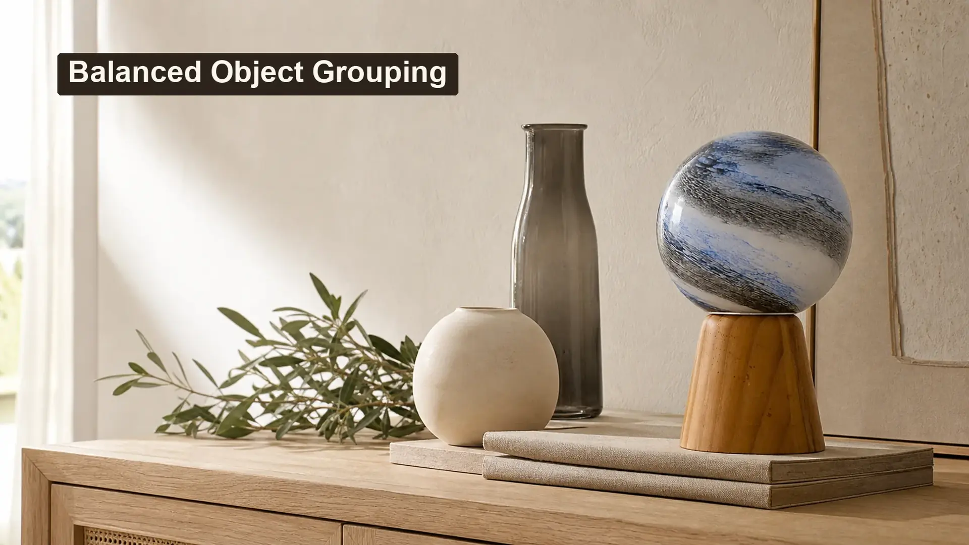
A balanced display gives every object a clear role. One item leads, one or two items support it, and the empty area around them keeps each silhouette readable. Balance can be symmetrical, but many modern displays use asymmetry because different heights and shapes create a more natural rhythm.
Visual weight matters as much as physical size. A dark, glossy, highly textured, or broad object may attract more attention than a taller pale object. Therefore, judge the complete arrangement from the main viewing direction rather than comparing dimensions alone.
Balanced displays always use three objects. False.
Two, three, or more objects can work when hierarchy, spacing, and visual weight remain clear.
Empty space is part of the arrangement. True.
Negative space separates silhouettes and prevents supporting pieces from competing with the lead object.
Start with a Lead Object and Supporting Roles
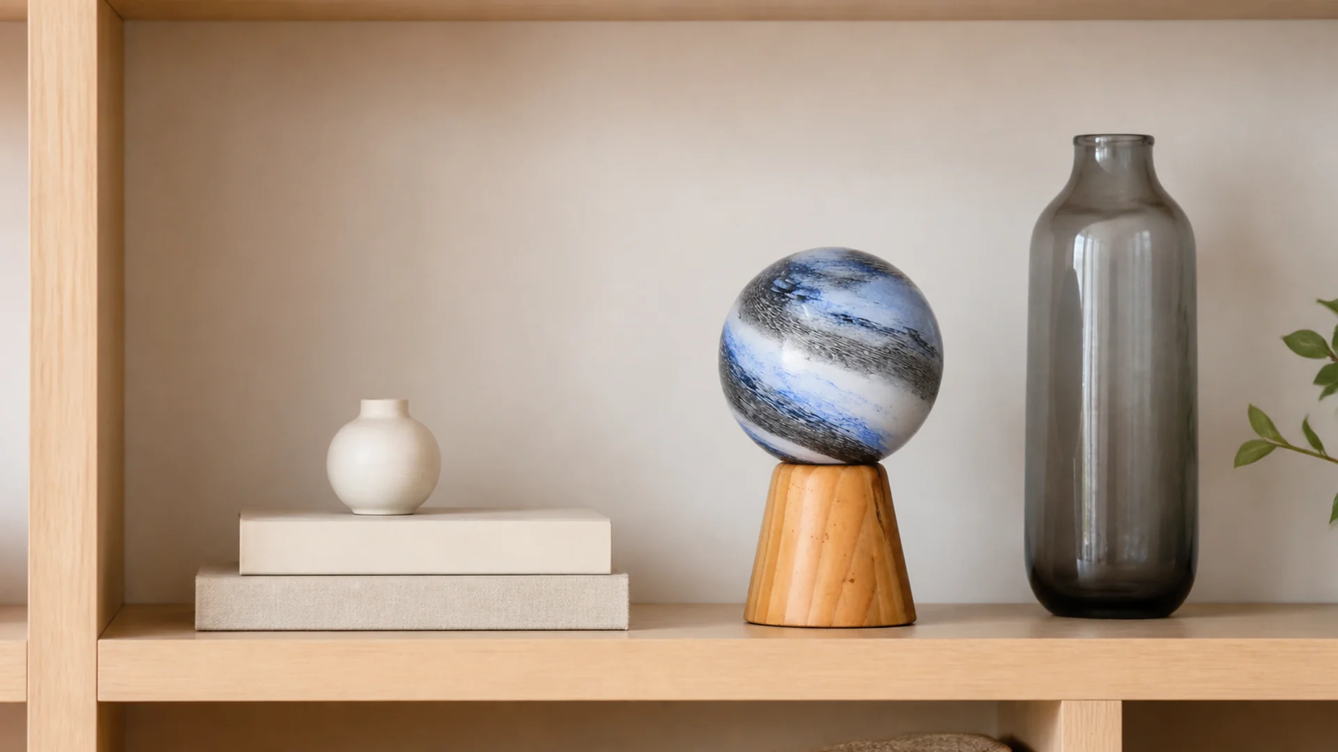
Choose the first object for its silhouette, color, finish, or emotional character. This is the lead. Then add quieter companions that reinforce the idea without repeating every feature. A rounded focal object, for example, can sit with a low stack of books and a taller narrow form.
The group should still make sense when viewed as a collection. Browse Table Top Accessories for object-led directions, then compare them with the broader Decor collection. Related Vases or Pots can support a display when their intended use and product description remain accurate.
| Display role | Useful object direction | What it contributes |
|---|---|---|
| Lead | Distinct silhouette, pattern, or finish | Creates the focal point |
| Low support | Books, tray, or compact object | Anchors the group horizontally |
| Tall support | Narrow vessel or vertical form | Adds height variation |
| Quiet connector | Repeated color, curve, or material | Makes unlike pieces feel related |
| Negative space | Clear surface around the group | Keeps every form readable |
Build Rhythm with Height, Shape, and Spacing
Height variation works best when it creates a deliberate sequence. A low-medium-tall rhythm is easy to understand, but the objects should not form a rigid staircase. Move one item slightly forward or backward so the group has depth.
Avoid equal gaps between every object. Small changes in spacing create a more natural relationship. However, objects should not overlap so heavily that their outlines disappear. On an open shelf, also leave enough space between the group and the shelf edges.
For a coordinated assortment, compare individual directions such as the DSC0012 tabletop accessory, HAC04 tabletop accessory, and DSC0014 tabletop accessory. Use these pages as visual review points, not as substitutes for confirmed specifications.
Balance Color and Material without Matching Everything
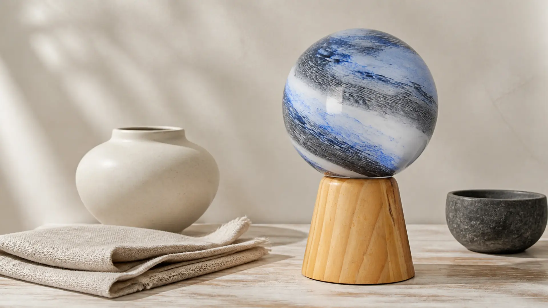
A group feels connected when at least one cue repeats. That cue may be a blue accent, a warm wood tone, a rounded curve, or a matte surface. The remaining elements can introduce contrast. Gloss beside matte, pale beside dark, or smooth beside tactile often gives a display more depth.
Keep the strongest pattern on the lead object. If every piece has a bold surface, the eye has no clear starting point. Similarly, a dark companion may need to be smaller or farther from the center because dark color can increase visual weight.
| Lead object characteristic | Useful supporting response | Common risk |
|---|---|---|
| Strong pattern | Quiet solids in related tones | Too many competing patterns |
| Glossy surface | Matte ceramic-look or linen texture | Excess reflection across the group |
| Rounded silhouette | One narrow form and one low form | Repeating identical round shapes |
| Dark color | Pale companions and more open space | One side feeling too heavy |
| Natural wood detail | Warm neutral textile or shelf tone | Unrelated wood tones becoming busy |
Every object must share the same material. False.
A repeated color, curve, or finish cue can connect different materials while preserving useful contrast.
The strongest pattern should have a clear role. True.
Using one patterned focal object and quieter companions makes the visual hierarchy easier to read.
Practical Tool: Five-Part Grouping Scorecard
Use this scorecard when styling a shelf, reviewing a sample group, or planning a retail assortment. Score every area from 0 to 2: 0 = unclear, 1 = partly resolved, and 2 = clear. A total of 8-10 suggests the group is ready for a final context check. A lower score shows what to revise.
| Review area | Question | Score 0-2 |
|---|---|---|
| Hierarchy | Can you identify the lead object immediately? | |
| Height rhythm | Do low, medium, and tall forms create movement? | |
| Visual weight | Does either side feel unintentionally heavy? | |
| Connection | Does one color, curve, or material cue repeat? | |
| Negative space | Can every important silhouette be seen clearly? |
After scoring, change only one variable at a time. Move a companion, remove one object, lower the contrast, or increase the empty space. Photograph the new arrangement from the expected viewing angle and score it again.
Translate the Display into a Product and Retail Brief
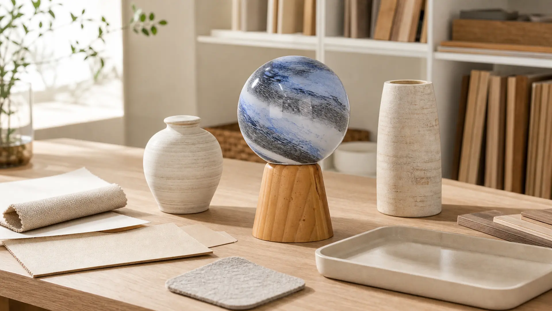
A strong vignette is still only a visual direction. Before selection or ordering, record each product category, confirmed dimensions, material description, color, finish, base stability, orientation, surface-care needs, packaging, target market, and labeling questions. If the group will be repeated across several stores, note the intended shelf or furniture dimensions as well.
Fragile decorative objects also need stable placement and careful handling. The Canadian Conservation Institute explains that ceramic and glass objects are brittle and may crack or break on impact even when an object appears structurally solid1. Its preventive-care guidance recommends stable support and reduced unnecessary handling during display and storage2. It also advises conservative cleaning for decorated or uncertain surfaces because unsuitable cleaning can damage applied decoration3. Apply these principles only where the confirmed product material and finish make them relevant.
When the display direction is organized, use Request a Quote to share the application, target market, object references, dimensions, finish direction, packaging needs, and unresolved questions. You can also use Contact Us for an initial collection discussion. Custom options depend on the product type and order requirements, so feasibility and final details still need confirmation.
FAQ
How many decorative objects should be grouped together?
There is no universal number. Two or three objects are useful starting points, but a larger retail display can use more when hierarchy and spacing remain clear.
Does the rule of three always create a balanced display?
No. Three objects can create an easy asymmetrical rhythm, but poorly matched scale or visual weight can still make the group feel unbalanced.
How do I mix decorative objects of different heights?
Use a low, medium, and tall relationship without creating a rigid staircase. Shift one object forward or backward to add depth.
Can vases, pots, and tabletop accessories be grouped together?
Yes, when their silhouettes and colors work together and each product’s intended use is described accurately. Do not infer material or function from appearance alone.
How much empty space should remain around a group?
Leave enough space to read each important outline and to keep the group away from vulnerable shelf edges. The exact amount depends on object scale and viewing distance.
Should every object use the same color?
No. Repeat one restrained color cue, then use related neutrals or controlled contrast for the supporting pieces.
What should retailers confirm before repeating a display?
Confirm product dimensions, finish, orientation, base stability, care information, packaging, shelf dimensions, and accurate product copy.
How should fragile decorative objects be handled?
Use stable surfaces, careful handling, adequate separation, and suitable protective packaging. Follow verified care information for the actual material and finish.
Conclusion
To group decorative objects successfully, give each item a role and judge the group as one composition. A clear lead object, varied height, controlled visual weight, one repeated cue, and enough negative space create a flexible method for homes and retail collections.
Action checklist
- Define the shelf, console, sideboard, or retail context.
- Select one lead object and describe why it leads.
- Add quieter companions with different heights or widths.
- Repeat one color, curve, finish, or material cue.
- Leave enough negative space to read every silhouette.
- Complete the Five-Part Grouping Scorecard from the main viewing angle.
- Confirm dimensions, material, finish, stability, care, packaging, and target-market details.
- Share the organized brief with JC Home Decor for product-specific discussion.
References
-
Canadian Conservation Institute – Ceramics and Glass – Supports careful placement and handling of brittle decorative objects.
↩ -
Canadian Conservation Institute – Preventive Care for Ceramics and Glass – Supports stable display, secure support, and reduced handling.
↩ -
Canadian Conservation Institute Notes 5/1 – Care of Ceramics and Glass – Supports conservative cleaning for decorated or uncertain surfaces.
↩