J.C Home Decor and Lighting Manufactory

Introduction
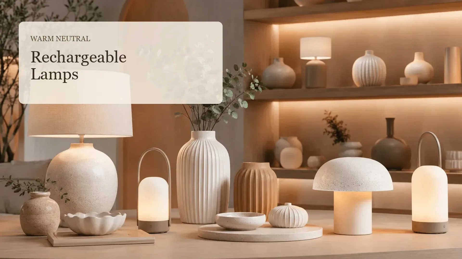
Neutral rechargeable table lamps can bring a softer, more intentional layer to a living room, bedroom, shelf, or retail display without making the lamp feel separate from the decor. Instead of treating beige, oat, clay, and muted bronze as interchangeable, use them to connect the lamp body, surrounding objects, and the light’s visual mood. This guide gives home decor brands, retailers, and interior designers a practical way to build warm-neutral lamp stories that feel calm, tactile, and easy to adapt.
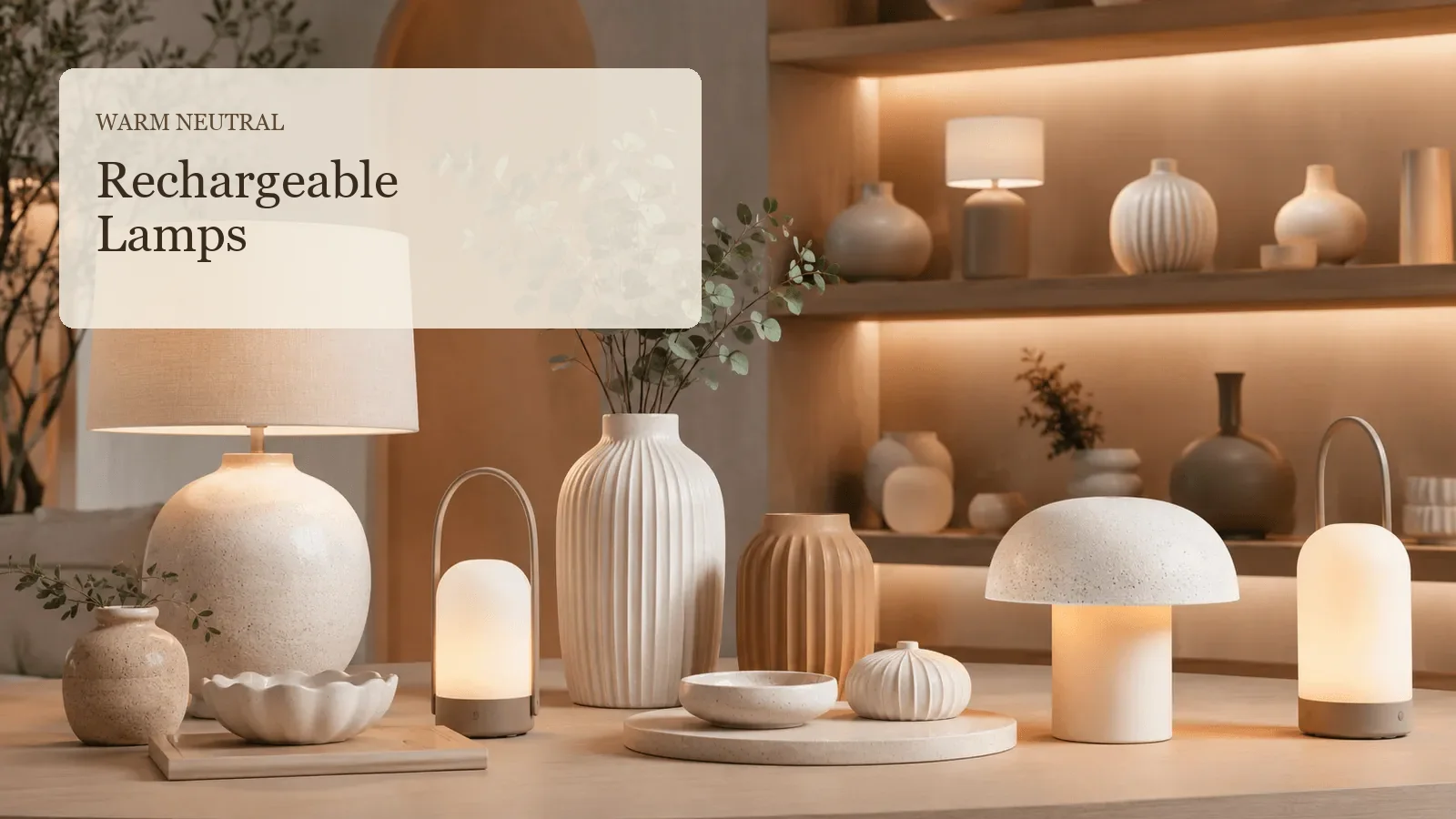
Start With a Warm-Neutral Story, Not Just a Beige Lamp
Warm neutrals work when they share an undertone. A creamy lamp can sit comfortably with pale oak, linen, and soft clay; a cooler grey-beige lamp may need darker stone, smoke glass, or brushed metal nearby to feel deliberate. The goal is not to make every object the same colour. It is to give the eye a small group of related materials to move through.
For a portable-lighting starting point, explore the Rechargeable Battery Lamps category alongside the wider Lighting collection. Product-specific finish, battery, charging, and intended-use details should always be confirmed before a final selection.
The Canadian Centre for Occupational Health and Safety notes that lighting should suit the task and visual environment, with glare and shadows considered as part of the overall setting.That is useful when a decorative lamp is intended to make a reading corner, bedside, or console feel inviting rather than visually harsh.1
Use the Warm-Neutral Pairing Matrix
The practical tool for this article is a Warm-Neutral Pairing Matrix. Begin with the lamp’s dominant finish, then select one grounding material and one softer supporting material. This creates a repeatable styling direction for a room vignette or a coordinated retail assortment.
| Lamp direction | Grounding material | Soft supporting material | Visual result | Good placement |
|---|---|---|---|---|
| Cream or ivory | Pale oak or travertine-look surface | Oat linen | Light and quiet | Bedside or reading corner |
| Sand or taupe | Walnut-look surface or dark bronze | Mushroom-toned ceramic | More depth without sharp contrast | Console or display shelf |
| Soft clay | Warm stone or aged brass detail | Natural woven texture | Tactile and collected | Living-room side table |
| Muted olive-neutral | Mid-tone wood | Putty or warm grey textile | Earthy, relaxed balance | Lounge or retail vignette |
The matrix is a visual planning tool, not a material specification. If a collection will include wood-look, ceramic-look, or metal-look finishes, describe them conservatively until the final product information is confirmed.

Let Soft Shapes Carry the Calm
Rounded lamp bodies, curved handles, low domes, and ribbed forms can make a neutral scheme feel less flat. Use one stronger silhouette as the visual anchor, then keep the nearby vase, tray, or book stack quieter. This is particularly helpful on a console where several decorative objects share one narrow surface.
A related table lamp direction can help a collection move between portable accents and more familiar decorative lamp forms. For a broader view of how lighting and decor can be developed as a coordinated story, see the JC Home Decor products overview.
Warm neutral means every object must be beige. False
A convincing palette needs gentle contrast in value, texture, or sheen. One darker bronze, olive, or charcoal accent can keep the arrangement from becoming visually flat.
One repeated finish can make a mixed display feel connected. True
Repeating a lamp’s warm metal detail, ceramic texture, or linen tone once or twice can create a clear relationship without making the display look matched.
Compare Matte, Textured, and Gentle-Sheen Finishes
Finish changes the way a neutral lamp reads under daylight and evening light. Matte surfaces usually feel quieter, while a restrained gloss or metal detail can give the composition a small point of contrast. Review the lamp beside the intended supporting materials rather than assessing it only against a white background.
| Finish character | What it adds to a neutral room | Pair with | Check before finalising |
|---|---|---|---|
| Matte ceramic-look | Softness and visual calm | Linen, chalky vase, pale wood | Surface texture and colour variation |
| Ribbed or textured body | Shadow and tactile interest | Simple tray and low-profile objects | Whether the texture competes with nearby patterns |
| Gentle gloss | A small reflective accent | Matte textiles and stone-look surfaces | Reflections in the intended location |
| Brushed metal detail | Definition around a soft palette | Warm wood, cream shade, muted glass | Tone match with other hardware |
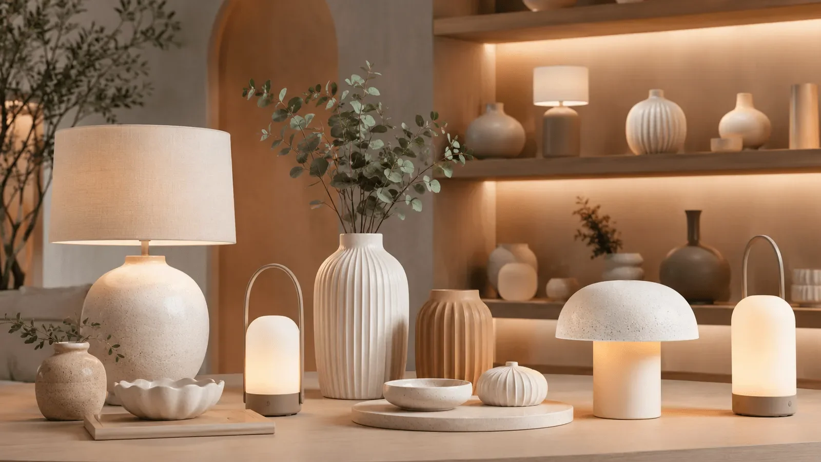
The European Commission identifies colour characteristics among the information associated with light sources in its ecodesign and energy-labelling context.For decorative lighting, that reinforces the value of considering the light’s appearance together with the surrounding finishes rather than treating the lamp as an isolated object.2
Build a Small Collection, Not a Repeated Look
For a retail story, use three roles instead of three near-identical pieces: one lamp as the focal point, one vase or tabletop object as a texture carrier, and one smaller object to repeat the palette. The result feels like a family of products, but each piece still has a reason to be there.
The earlier article on styling cordless table lamps on shelves and consoles offers a useful placement companion, while small-space portable lamp ideas focuses on activity zones rather than colour direction. Keep this article’s angle distinct: it is about palette, shape, and finish relationships.
A neutral lamp automatically works in every neutral interior. False
Undertones, scale, texture, and nearby finishes can still clash. Test the lamp with the intended wood, textile, ceramic, or metal direction whenever possible.
A portable lamp can support a flexible decor story. True
When the lamp’s details are visually compatible with the room, it can move between a side table, console, shelf, or occasional display without breaking the palette.
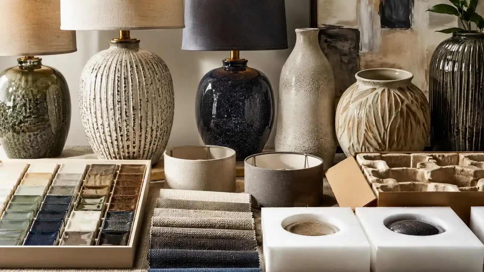
Apply This to Your Next Display
Use this short action checklist before styling a warm-neutral lamp story:
- Name the palette’s undertone: creamy, sandy, clay-based, or olive-neutral.
- Choose one anchor material and one softer supporting texture from the pairing matrix.
- Keep one lamp silhouette as the focal point; do not give every object equal visual weight.
- Check the composition in daylight and with the lamp switched on.
- Confirm product-specific finishes, charging details, and intended-use requirements before final selection.
For custom colour, finish, lampshade, or collection discussions, the lighting contact page is the appropriate next step.
FAQ
Where do neutral rechargeable table lamps work best?
They work well on side tables, bedside surfaces, consoles, shelves, and occasional retail vignettes where a local layer of decorative light is useful. Start with a stable surface and a palette that relates to nearby materials.
Which neutral colours feel warm rather than cool?
Cream, oat, sand, mushroom, warm taupe, soft clay, and muted olive often read as warm when paired with suitable wood, textile, or metal tones. Their final appearance still depends on the surrounding light and finishes.
Can a rechargeable lamp work with dark wood furniture?
Yes. A cream or sand-coloured lamp can create a gentle contrast with darker wood. Repeat a warm brass, bronze, or woven accent so the contrast feels connected rather than accidental.
Should every object in a neutral display have the same finish?
No. Mix matte, lightly textured, and gentle-sheen surfaces to create depth. Keep the undertone related and limit the number of competing patterns.
How can retailers turn this look into a product story?
Use one lamp, one textural decor object, and one smaller palette-repeating accent as a simple display group. Change the focal lamp or background material for seasonal updates while keeping the colour family consistent.
Does a neutral lamp need to match the wall colour exactly?
No. A close relation is usually more natural than an exact match. Contrast in texture, value, or silhouette helps the lamp remain visible.
What should be checked before using a rechargeable lamp in a display?
Confirm the product’s specific charging method, battery guidance, intended conditions, and stability on the chosen surface. The U.S. Fire Administration advises following battery instructions and discontinuing use when a lithium-ion battery shows unusual heat, odour, leaking, shape change, or unusual sounds.Keep portable battery products away from excessive heat and direct sunlight.3
Conclusion
Warm-neutral rechargeable lamps are most persuasive when colour, silhouette, and finish work as one quiet system. Use the pairing matrix to create enough relationship between the lamp and its setting, then use a single contrasting detail to keep the composition alive. Explore the rechargeable lamp collection or request a quote when you are ready to discuss a coordinated decorative lighting direction.
References
- CCOHS: Lighting Ergonomics – General – Supports task, glare, shadow, and visual-environment guidance. Back
- European Commission: Light Sources – Supports light-source and colour-characteristic context. Back
- U.S. Fire Administration: Battery Fire Safety – Supports conservative battery-care guidance. Back