J.C Home Decor and Lighting Manufactory

Introduction
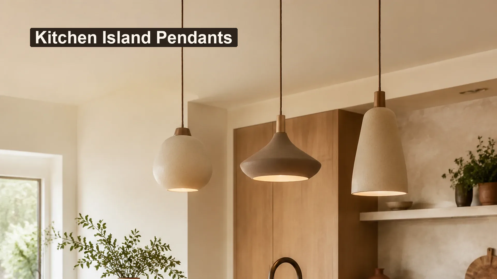
Pendant lighting ideas for kitchen islands work best when the fixture arrangement follows the island’s proportions, the room’s visual weight, and the way people use the surface. This guide helps lighting retailers, designers, and home decor brands compare single pendants, grouped pendants, shade profiles, finishes, and collection directions before a final product brief is prepared.
The goal is not to prescribe one installation formula. A successful concept should balance scale, sightlines, material language, cleaning needs, and the electrical details that must later be confirmed for the intended market. It should also leave enough flexibility for a coordinated lighting collection rather than a one-off fixture.
The Design Idea in Brief
Kitchen islands are long, visually important surfaces. Pendant lighting can define that zone, add a focal layer, and connect the kitchen to the wider home. The strongest ideas usually start with three questions:
- Is the island better served by one visual statement or a repeated group?
- Should the pendants blend with the cabinetry, contrast with it, or introduce a supporting material?
- Does the selected silhouette leave comfortable sightlines across the room?
For retail and product development teams, these questions turn a broad style direction into a useful product conversation. A design brief can then cover shade shape, body finish, suspension details, size options, packaging, labeling, and target-market requirements.
One large pendant is always the best solution. False.
A single fixture can suit a compact island or a strong sculptural concept, but a longer island may need a repeated rhythm or a wider linear form. The decision depends on the island, room, and fixture proportions.
The island and fixture should be evaluated as one composition. True.
The island length, countertop material, seating arrangement, cabinetry, and pendant silhouette all affect visual balance. Reviewing them together reduces the risk of a fixture that feels too small, too busy, or visually disconnected.
Start with the Island Proportion
Before choosing a finish or a trend-led silhouette, record the island’s length, depth, seating side, ceiling height, and the main sightlines through the room. A product that looks balanced in a catalog image may feel crowded when the island is narrow or when the kitchen opens directly into a living area.
A practical island proportion worksheet
Use the following worksheet for a first design review. It is a planning tool, not an installation code or a substitute for a qualified professional’s project review.
| Item to record | Why it matters | Design decision it supports |
|---|---|---|
| Island length and depth | Establishes the visual footprint | Single statement, paired fixture, or repeated group |
| Seating position | Shows where sightlines need to remain open | Shade height, openness, and suspension rhythm |
| Ceiling height | Changes how much vertical presence the fixture can carry | Compact pendant, taller silhouette, or layered grouping |
| Cabinet and countertop finish | Sets the surrounding material language | Match, contrast, or supporting finish |
| Room connection | Reveals views toward dining or living areas | Whether the fixture should be quiet or sculptural |
| Cleaning and handling needs | Helps anticipate daily use | Smooth finish, accessible form, and care guidance |
For a first layout, sketch the island as a rectangle and mark the visual centerline. Then test one, two, or three pendant positions without treating the sketch as a final electrical plan. This simple step helps a design team compare rhythm before discussing custom dimensions.
If the project is for a wider product collection, review the direction alongside JC Home Decor’s Ceiling Pendants category and Products page. These pages provide the right category relationship without forcing one unverified fixture specification into the article.
Single Pendants for a Clear Focal Point
A single pendant can work well when the island is compact, the room already has strong architectural detail, or the design brief calls for a quiet focal point. It can also be useful in a retail collection as the hero shape that establishes the visual language for related sizes.
When a single pendant makes sense
- The island has a compact or visually simple form.
- A sculptural shade or body is intended to be the main accent.
- The surrounding kitchen already contains several strong lines or materials.
- The fixture needs to connect visually with a dining or living-area pendant.
The main risk is undersizing. A small pendant placed above a long island can look accidental rather than intentional. The opposite risk is choosing a very broad shade that dominates the room or blocks the view through an open-plan layout. When comparing samples, assess the fixture from the seated side, the entry path, and the adjoining room.
For a brand or importer, this is also the point to decide whether the collection needs one signature proportion or a family of related widths. The question is not only how the product looks above one island; it is how the same design language can work across different retail homes and room scales.
Grouped Pendants for Rhythm and Repetition
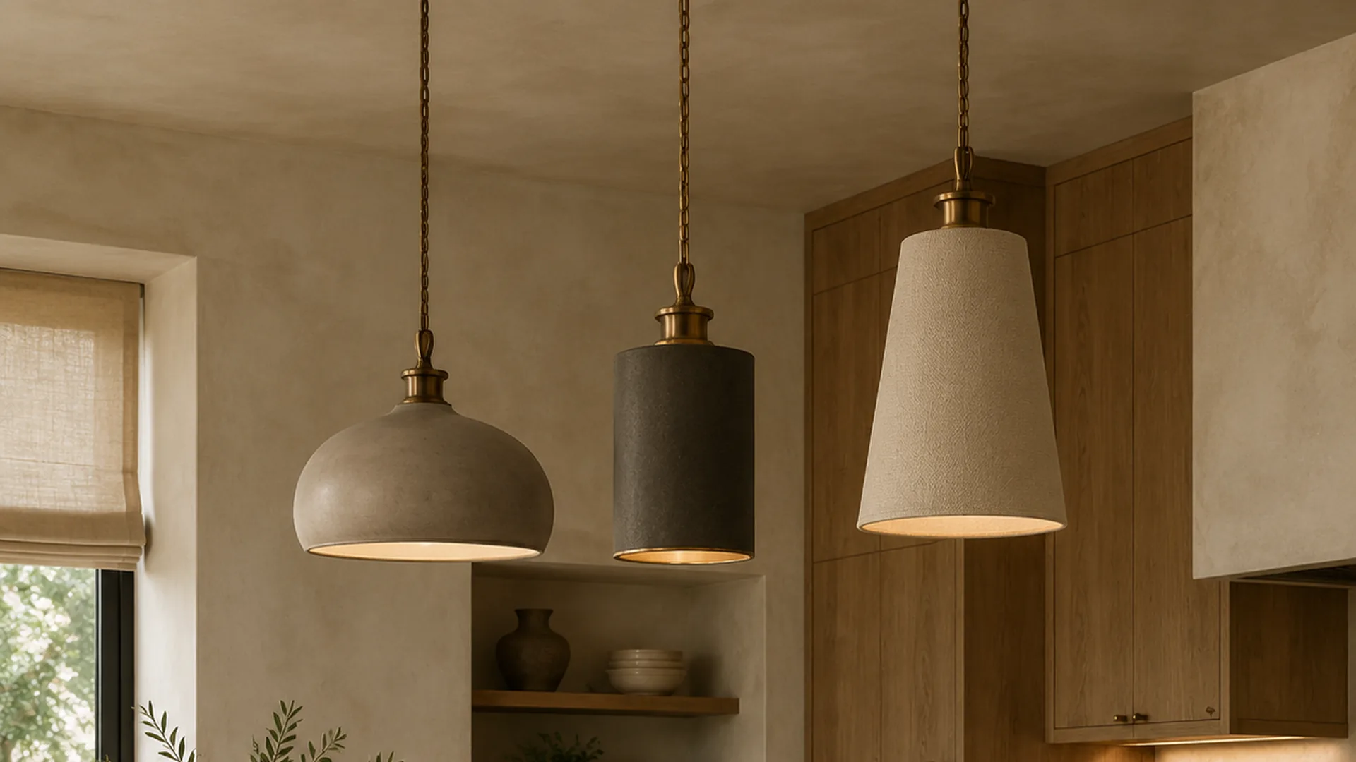
Two or three pendants can create a measured rhythm above a longer island. Repetition makes the arrangement feel deliberate, but repetition also magnifies inconsistency. Shade diameter, suspension length, finish tone, and visual spacing should be reviewed as a set.
Keep the group visually coherent
Choose one primary relationship and let the other elements support it:
- Repeat the same silhouette for a calm, architectural line.
- Repeat the finish while varying the shade profile for a softer collection story.
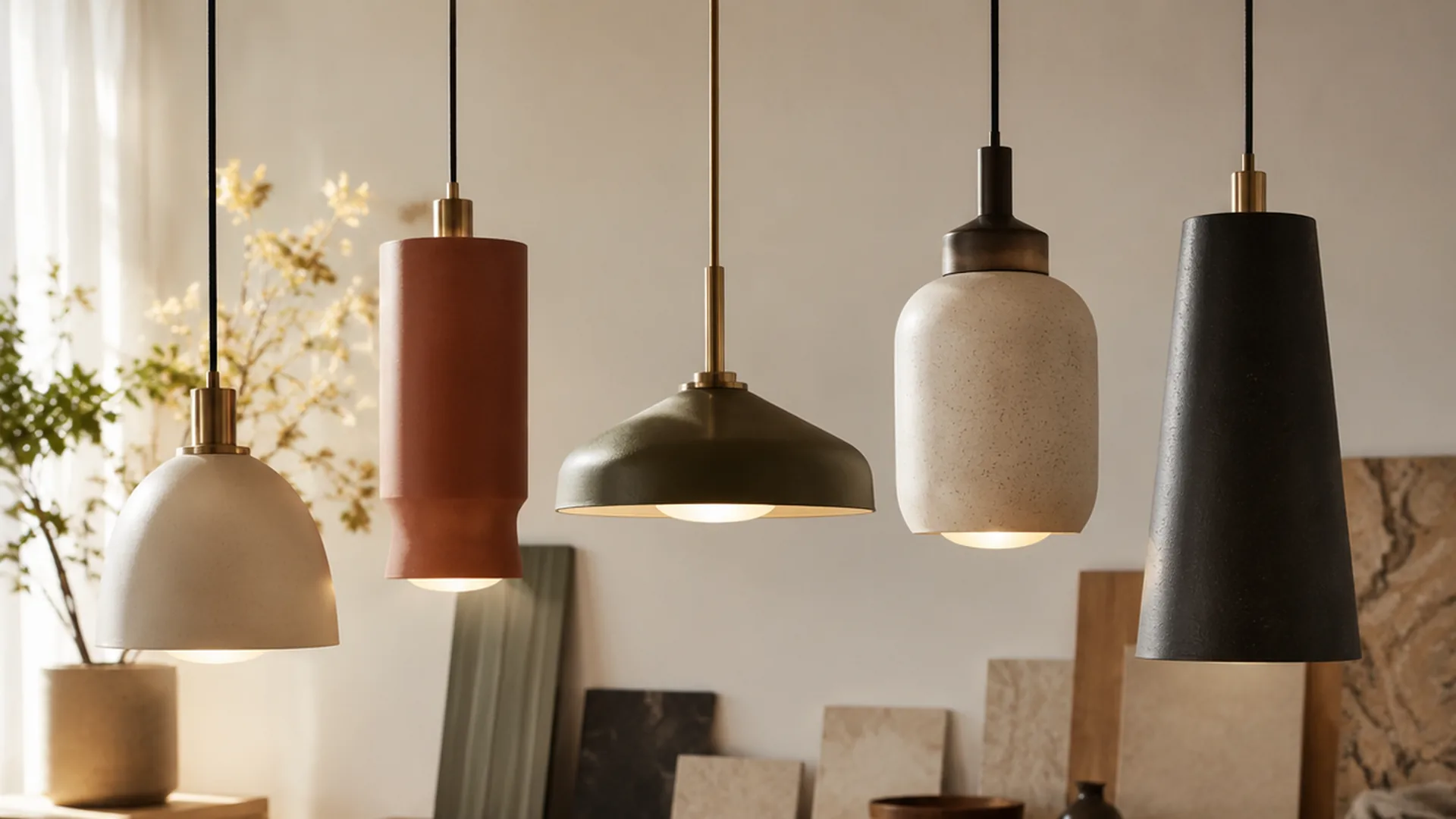
- Use related shapes in one material family for a more collected, design-led look.
- Combine a quiet central shape with smaller supporting pendants only when the island and room can carry the contrast.
The group should not become a cluster of unrelated objects. In product development, create a small comparison board with the body finish, shade fabric or material direction, ceiling canopy, suspension detail, and packaging notes. That board is more useful than choosing each component from a different reference image.
| Arrangement direction | Visual character | Best product discussion |
|---|---|---|
| One central pendant | Focused and calm | Hero silhouette, shade scale, finish contrast |
| Two coordinated pendants | Balanced and flexible | Pair spacing, shared finish, alternate room sizes |
| Three repeated pendants | Rhythmic and graphic | Consistent proportions, suspension details, collection depth |
| Mixed but related group | More expressive | Shape hierarchy, visual weight, finish control |
For related sourcing considerations, the decorative lighting supplier guide can support the wider conversation around product category, finish, and buyer questions. It should complement this room-use article rather than replace the island-specific visual review.
Match the Pendant Shape to the Kitchen Language
The shade or body profile often determines whether the island feels softer, more architectural, more traditional, or more handmade. The best choice depends on the kitchen’s existing lines rather than on a trend label alone.
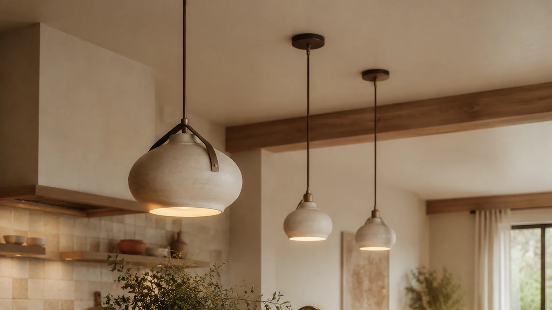
Rounded and organic forms
Rounded shades and softly curved bodies can balance a kitchen with stone, timber, fluted cabinetry, or other linear surfaces. Textured or ceramic-inspired finishes may add tactile depth, but the exact material and construction should be confirmed from the product information and sample.
Cylindrical and drum forms
Cylindrical shades are easy to coordinate with rectangular islands and calm cabinetry. A repeated row can look particularly clear when the shade diameter, suspension height, and finish are consistent. For retail packaging, the vertical shape also needs careful inner protection and carton planning.
Conical and tapered forms
Conical shades direct the eye toward the island and can introduce a more graphic outline. They should be checked from multiple angles because the lower opening and shade depth affect how much visual mass the pendant adds.
Open and woven-looking forms
Open structures can create a lighter visual effect and show more of the ceiling and background. They may also create more visible dust and shadow patterns. Buyers should confirm cleaning guidance, surface treatment, and material description rather than assuming that a visual effect represents a specific natural material.
A pendant’s visual material can be described as the same physical material. False.
A wood-look, rattan-look, marble-look, or ceramic-style effect should not be presented as solid wood, natural rattan, marble, or ceramic unless the product information confirms it.
A sample review should cover finish, shade, hardware, and proportions. True.
Screen images can change with lighting and color settings. A sample helps a buyer compare the physical finish, visible construction, shade profile, and relationship between components.
Coordinate Color and Finish Without Making the Room Flat
Kitchen island pendants do not need to match every surface. A more durable collection direction usually has one anchor finish, one supporting neutral, and one controlled accent.
Three useful coordination approaches
- Quiet continuity: Use a warm neutral or soft metal tone that sits comfortably with the cabinetry and countertop.
- Material contrast: Pair a tactile shade or ceramic-inspired body with a simpler ceiling and hardware treatment.
- Edited accent: Use a darker, aged, or colored finish as a focal note while keeping the surrounding forms restrained.
Color communication should not rely only on a screen. Lighting conditions, glaze, texture, metal finish, fabric, and production variation can affect the final appearance. A buyer preparing a collection should confirm color, finish, shade material, and packaging presentation through samples before bulk order confirmation.
| Kitchen direction | Pendant response | What to confirm in samples |
|---|---|---|
| Light oak and warm neutral cabinetry | Soft neutral, woven-looking, or muted metal direction | Undertone, texture, shade opacity, hardware tone |
| Dark cabinetry or stone | Lighter shade or warm contrast | Brightness of finish, edge detail, visual weight |
| Minimal white kitchen | Sculptural shape or restrained dark accent | Surface quality, silhouette, cleaning practicality |
| Colorful or highly detailed kitchen | Simpler repeated form | Finish consistency, proportion, and visual quietness |
The custom lighting and packaging guide is a useful next step when the visual direction needs to become a product, branding, or packaging discussion. JC Home Decor can discuss custom options based on product type, order requirements, target market, and packaging needs; final details should be confirmed before an order is finalized.
Consider the Product Brief Beyond the Room Image
A kitchen island image can make a fixture look complete before the practical product questions have been answered. For a retail collection or product development brief, separate the visual decisions from the confirmation decisions.
| Brief area | Questions for the buyer | Confirmation point |
|---|---|---|
| Product form | What silhouette, diameter, height, and shade opening are needed? | Product drawing or approved sample |
| Electrical parts | Which holder, cord, plug, switch, and target-market details apply? | Product information and market review |
| Finish | Is the finish matte, glossy, textured, antique, painted, or glazed? | Physical sample and finish description |
| Suspension | What canopy, cord, rod, or hanging detail supports the design? | Component and installation review |
| Packaging | How should the shade and fragile components be protected? | Inner protection, retail box, export carton, labels |
| Communication | What names, images, care notes, and warnings are needed? | Approved product copy and artwork |
Requirements can vary by product type and market. Buyers should confirm market documentation and conformity information3, along with labeling, electrical details, packaging, and installation information, with the appropriate project or market specialists. General home-fire-safety guidance also reinforces the need to keep lighting decisions connected to the responsible professional review. 4 This article does not certify any product or define a complete installation requirement.
For broader collection planning, the home decor and lighting manufacturer guide for trade buyers can be paired with the article’s island-specific worksheet. Retail buyers may also review the wholesale home decor and lighting buying guide before deciding which pendant direction belongs in a wider assortment. General lighting product information from the U.S. Department of Energy1 and ENERGY STAR2 can also help buyers frame product questions without replacing project-specific review.
How to Adapt the Look for Different Customer Needs
The same pendant idea can serve different customers when the design logic is kept clear.
- Lighting retailers: Build a small family with one hero proportion, one compact option, and one grouped-display direction.
- Home decor brands: Connect the pendant finish to table lamps, vases, or tabletop accents without forcing every item to be identical.
- Interior designers: Prepare a visual brief that separates room inspiration from the final technical and product confirmation stage.
- Importers and wholesale partners: Confirm packaging, labeling, electrical parts, target market, and product communication early.
When coordinated lighting and decor are needed, use the Solutions page to frame the discussion around product categories and partner needs. If the brief is ready for a product conversation, buyers can use Request a Quote or Contact Us to share the target style, dimensions, finish, packaging, and market information.
FAQ
Are one or three pendants better above a kitchen island?
Neither arrangement is automatically better. One pendant can create a clear focal point, while three repeated pendants can establish rhythm across a longer island. Compare the island length, room sightlines, and fixture proportions together.
How do I choose a pendant shape for a modern kitchen?
Start with the kitchen’s strongest lines and materials. Cylindrical and tapered forms can support a more architectural room, while rounded or tactile forms can soften linear cabinetry. The final choice should be tested with the countertop, seating, and adjoining room in view.
Should kitchen island pendants match the cabinet hardware?
They can match, coordinate, or intentionally contrast. A controlled relationship is usually more useful than an exact match across every surface. Confirm the finish undertone and reflectivity through a physical sample when possible.
Can a pendant collection use different shapes?
Yes, if the shapes share a clear relationship such as finish, material direction, shade detail, or proportion. A collection brief should explain which element stays consistent and which element changes.
What should a buyer confirm before requesting a pendant quote?
Prepare the preferred silhouette, approximate dimensions, finish direction, shade or body material, suspension details, target market, packaging needs, product images, and any branding or labeling requirements. Samples and final technical details should be discussed before order confirmation.
Are product colors exactly the same as photos?
Not always. Screen settings, lighting, glaze, texture, fabric, metal finish, and production variation can affect appearance. Confirm color and finish through samples and approved references.
Can pendant lighting ideas for kitchen islands be used in restaurants?
The visual ideas may also inform selected dining or hospitality applications, but the requirements can differ. Electrical, installation, cleaning, fire-safety, and local project requirements should be reviewed separately by the responsible professionals.
Can JC Home Decor discuss custom pendant options?
Custom options can be discussed based on product type, order requirements, target market, packaging, and the requested design direction. The buyer should provide a clear reference, dimensions, finish preference, and intended use so the product discussion can stay specific.
Conclusion
The most useful pendant lighting ideas for kitchen islands begin with proportion, not decoration alone. Decide whether the room needs one focal pendant, a repeated group, or a related family of forms. Then review shape, finish, sightlines, cleaning, packaging, electrical details, and target-market communication as one product brief.
Kitchen Island Pendant Action Checklist
- Record island length, depth, seating position, ceiling height, and room sightlines.
- Compare a single pendant, paired arrangement, and repeated group at the same visual scale.
- Select one primary silhouette and define which collection elements should stay consistent.
- Confirm the physical finish, shade material, color, hardware, and visible proportions through samples.
- Prepare electrical, labeling, packaging, care, and target-market questions before requesting a quote.
- Review whether the pendant direction connects naturally with the wider lighting and decor assortment.
- Share the design reference, dimensions, finish direction, and packaging needs with the product partner.
References
- U.S. Department of Energy: LED Lighting – General lighting efficiency and product-selection context. ↑
- ENERGY STAR: Light Bulbs – Consumer-facing lighting product information and efficiency context. ↑
- Your Europe: Technical Documentation and EU Declaration of Conformity – General market documentation and conformity-information context for products sold in the European Union. ↑
- National Fire Protection Association: Home Fire Safety – General safety context supporting professional review of lighting and home environments. ↑